Clara Kuhnke/ 2024/ visual communication ZHdK
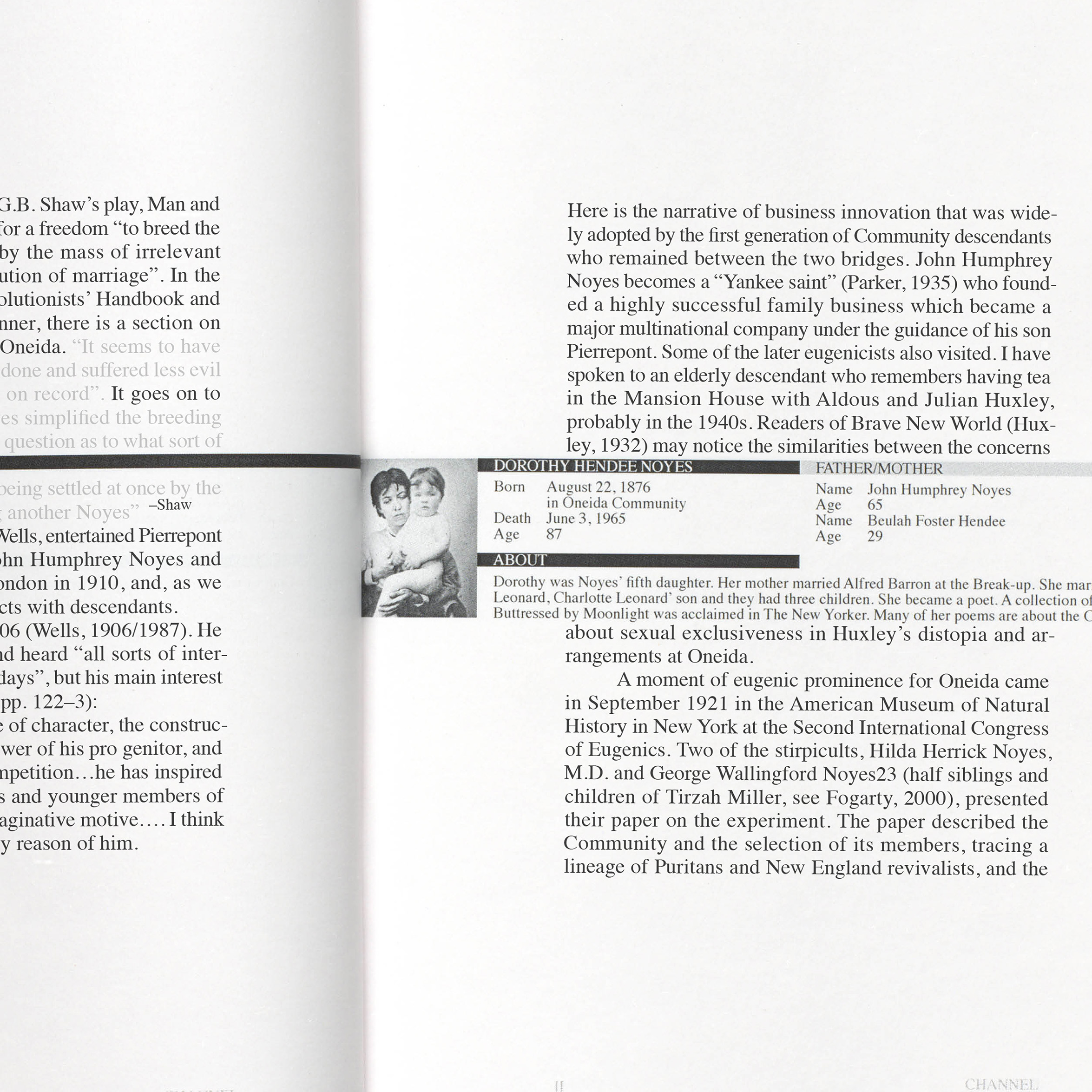
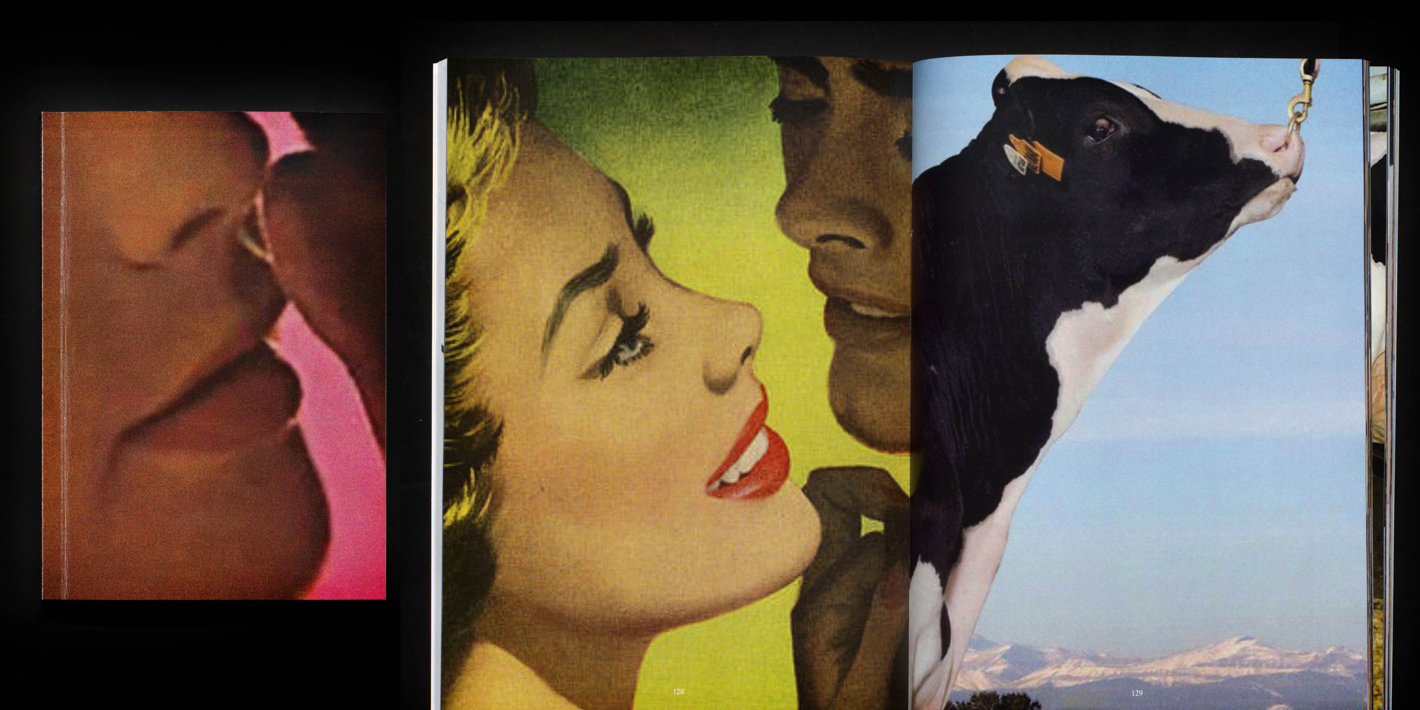
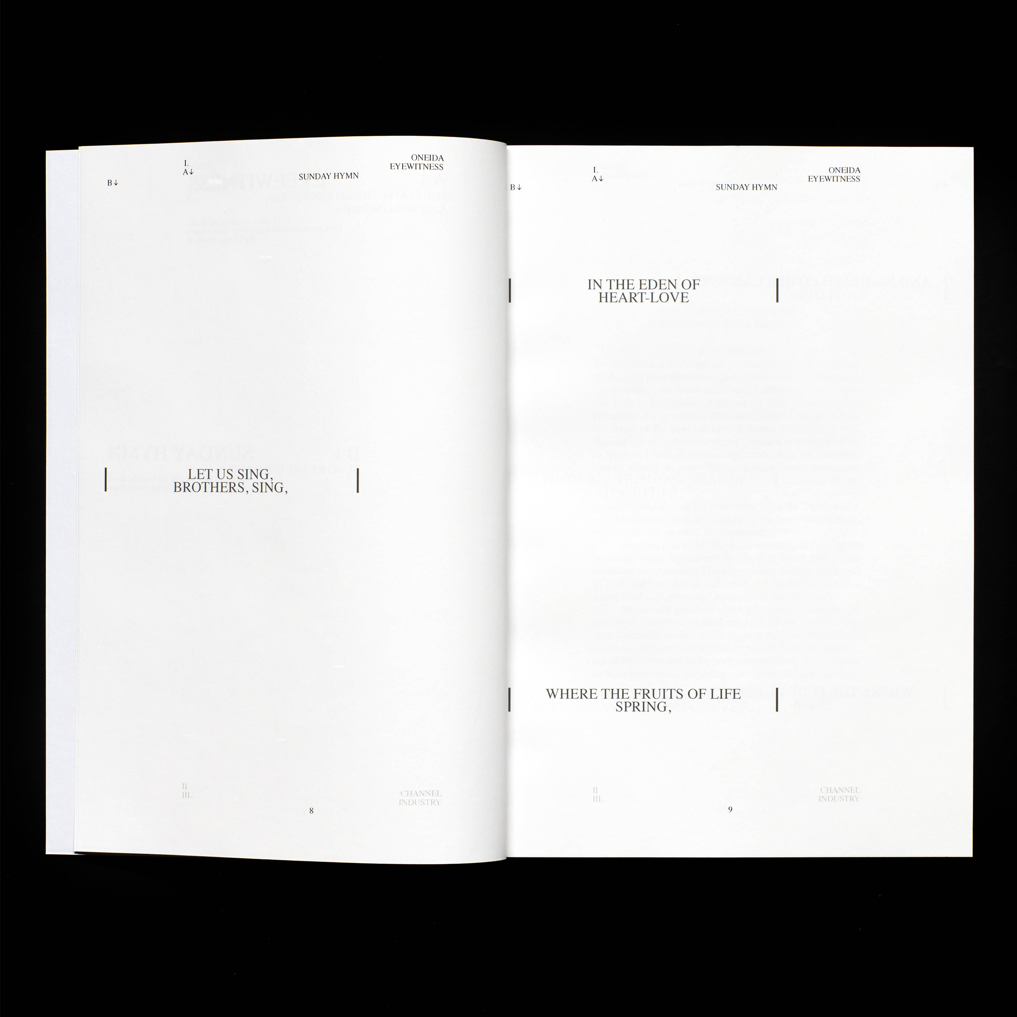
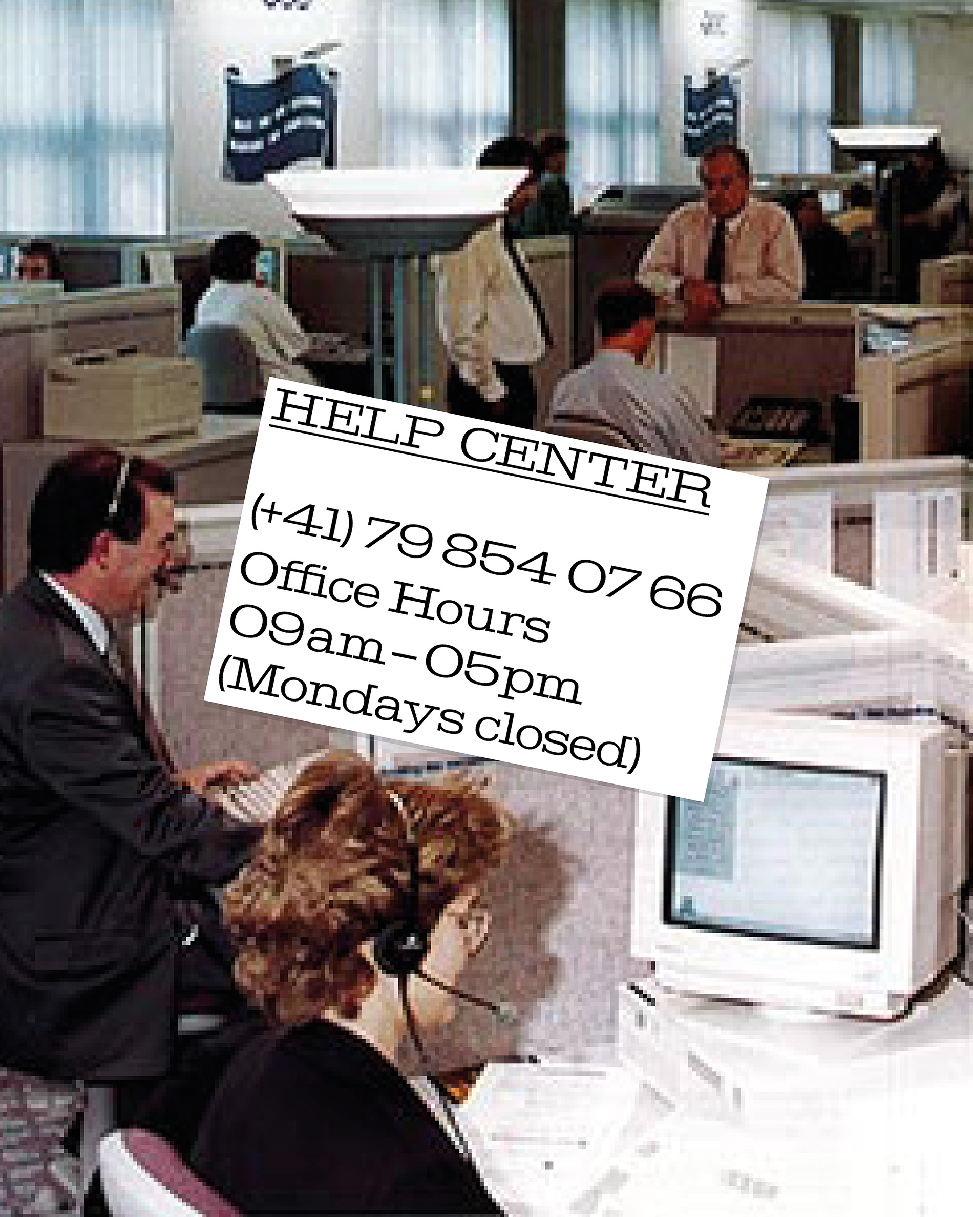
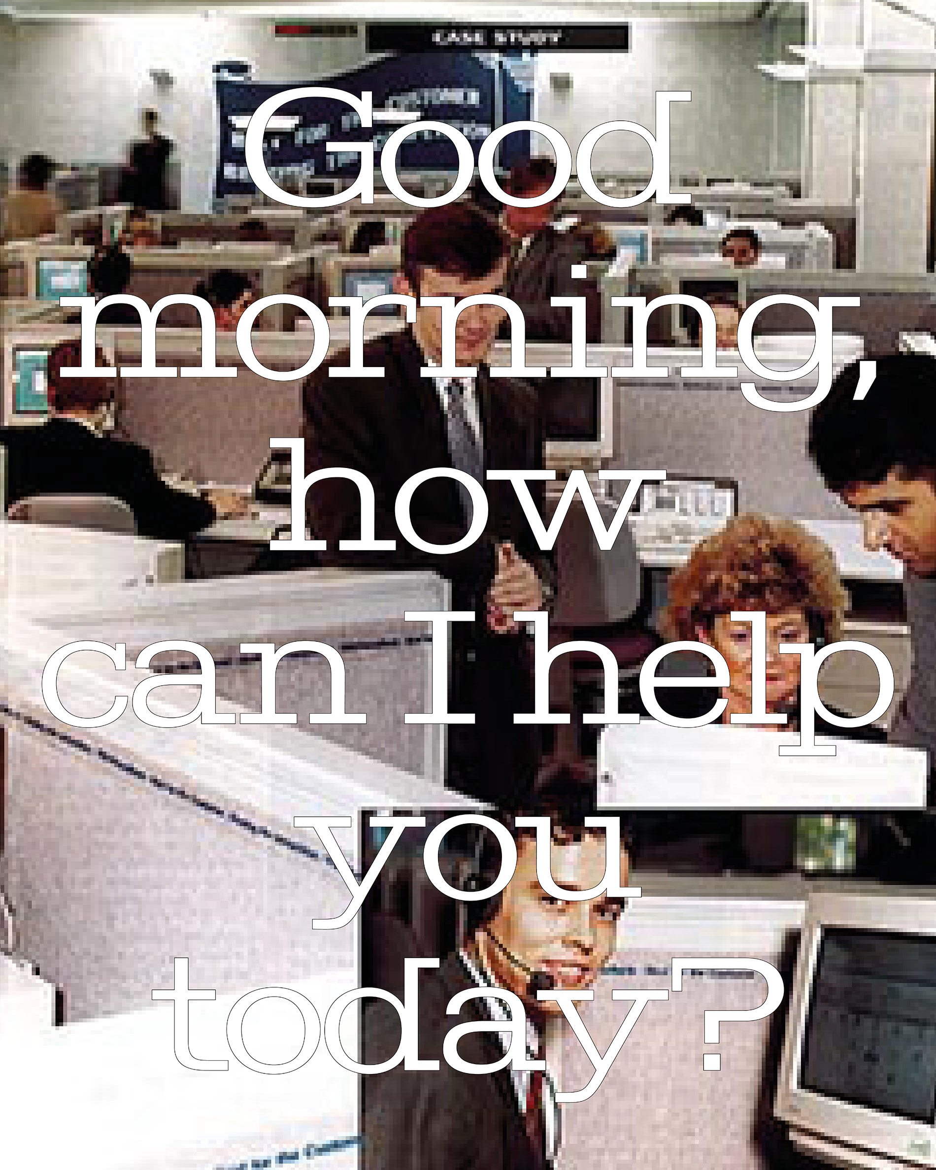
This editorial focuses on the dark side of the shiny „Oneida“ cutlery. In three parts we compare the eugenic experiments and goal of perfectionism within the „Oneida“ cult in the US with the breeding of animals and the contemporary goal of mental and physical health. We draw the attention to the shocking connection of this cult founded in 1848 and current behavior and ways of thinking.
This publications was edited, designed and produced together with Lois Grimm.
Silverness Wellware/ June 2024/ Editorial
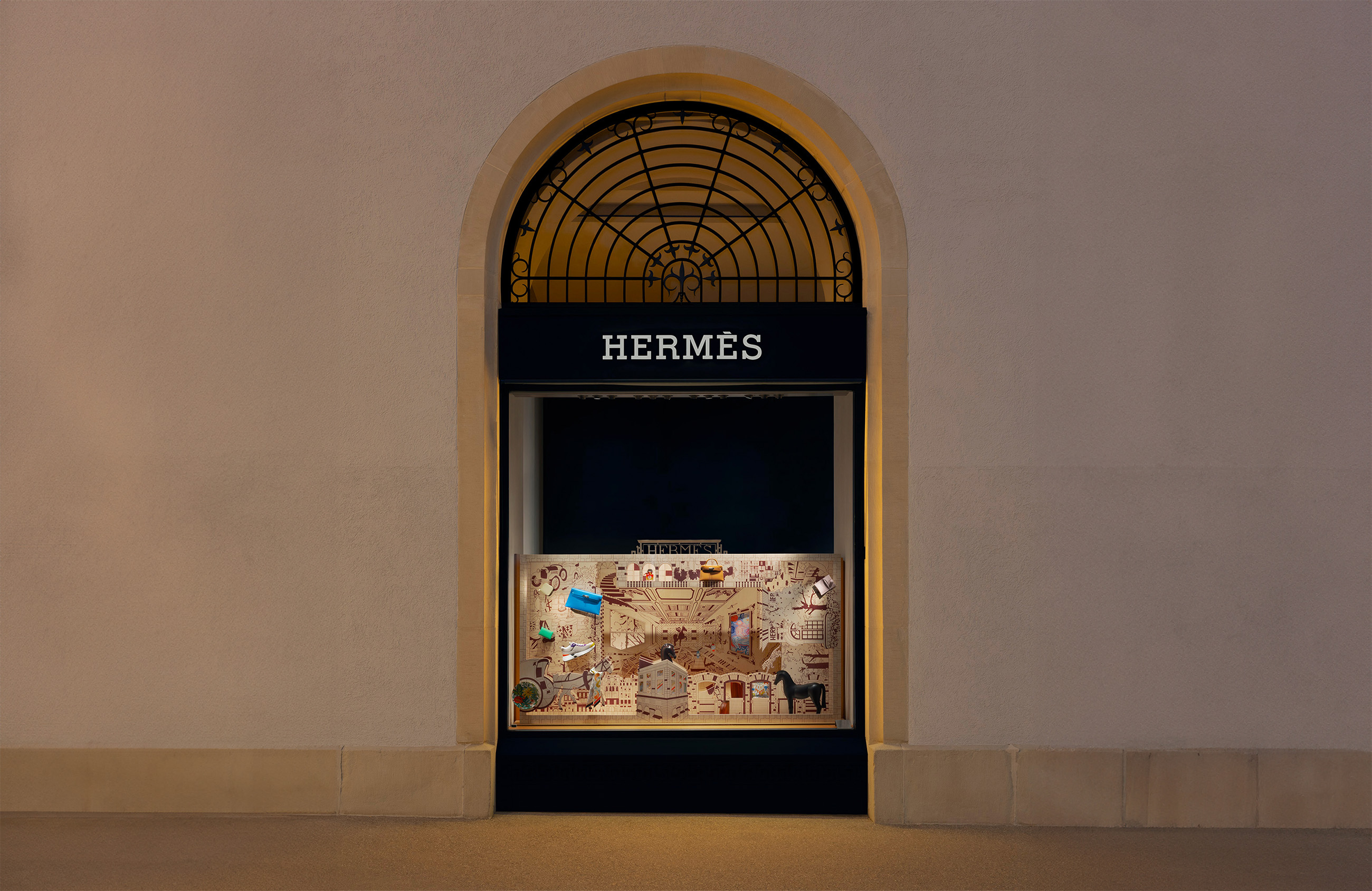
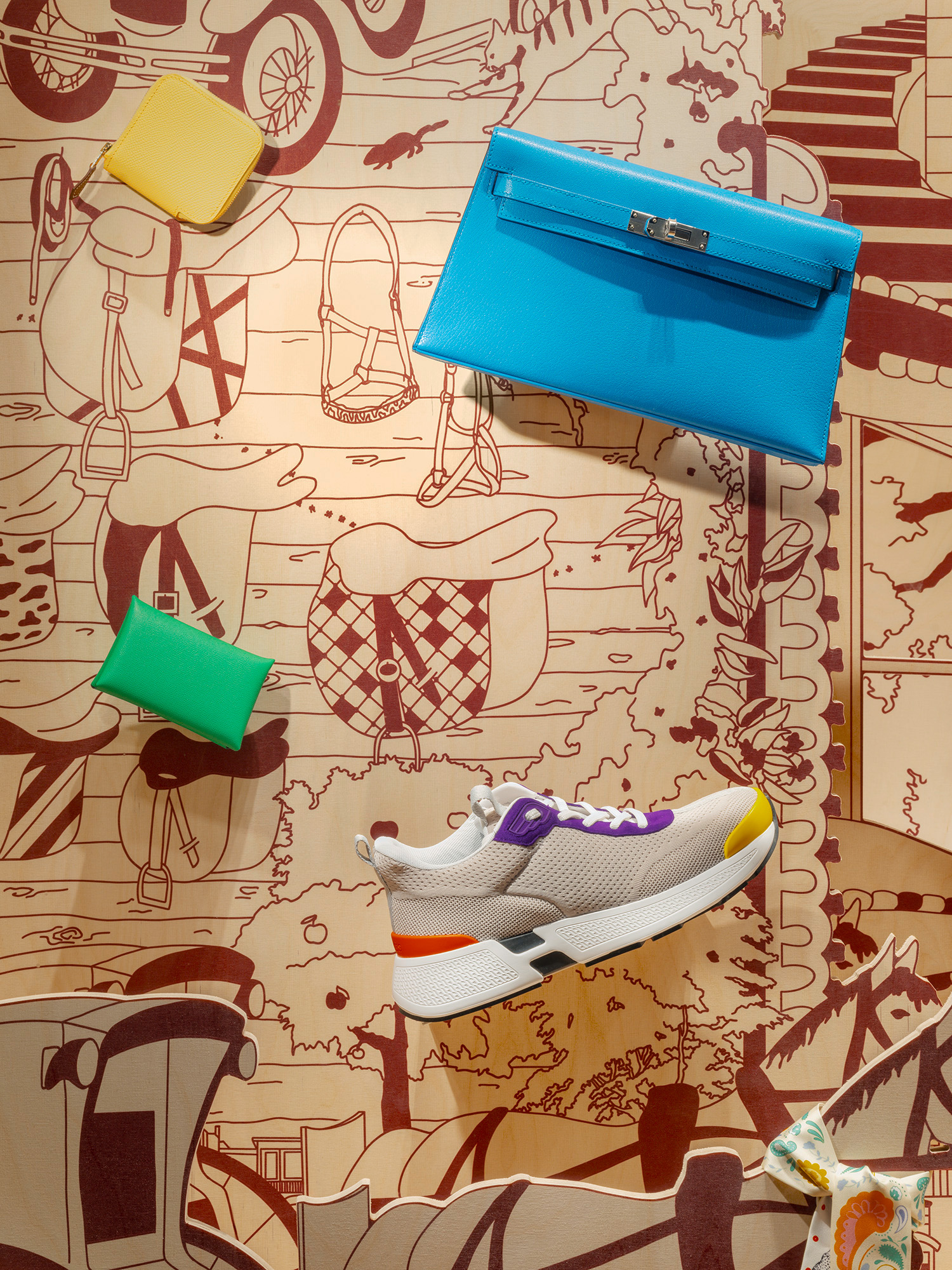
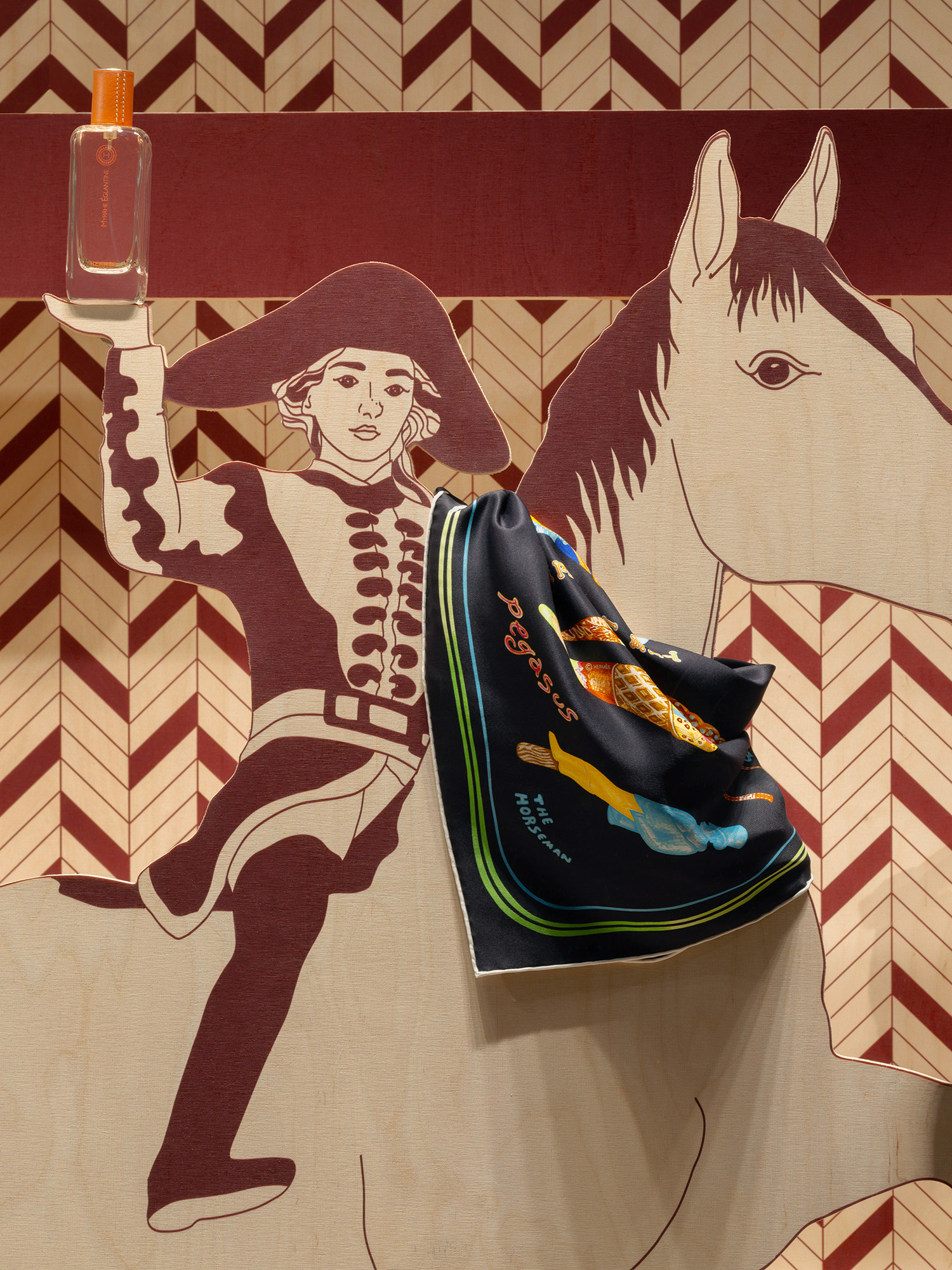
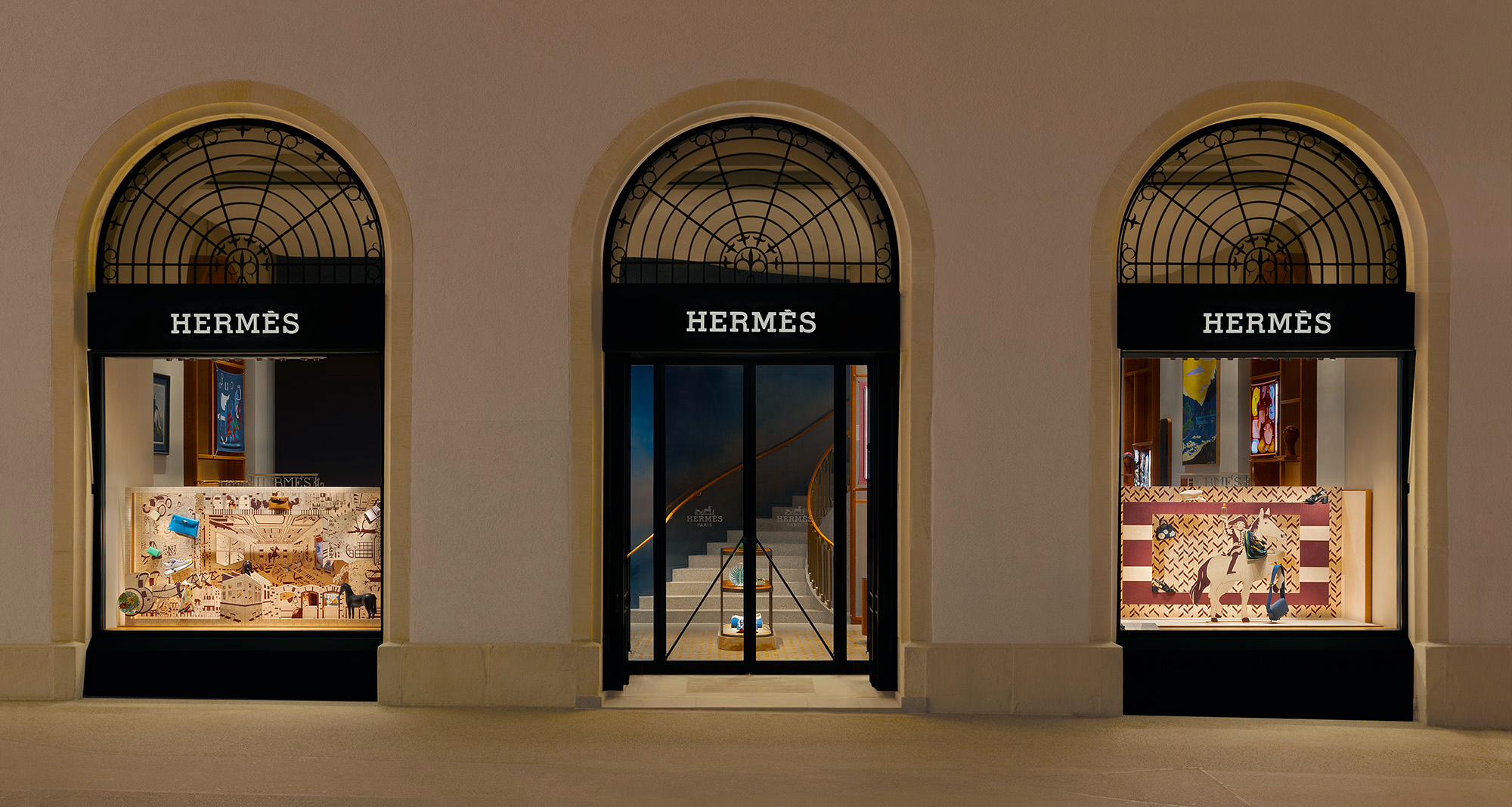
To lose yourself means to find yourself – is what I felt after visiting the House of Hermès in Paris („Faubourg“). Focusing on this years theme „L’esprit de Faubourg“ a complex illustration of this world of craftsmanship, tradition and spirit was created. We are giving the observer the chance to dive into the history of the fashion house through the two windows at Paradeplatz Zurich.
To be seen at Paradeplatz from July to October 2024.
In collaboration with Jennifer Anger and Davide Iozzo.
Hermès/ June 2024/ Window Concept
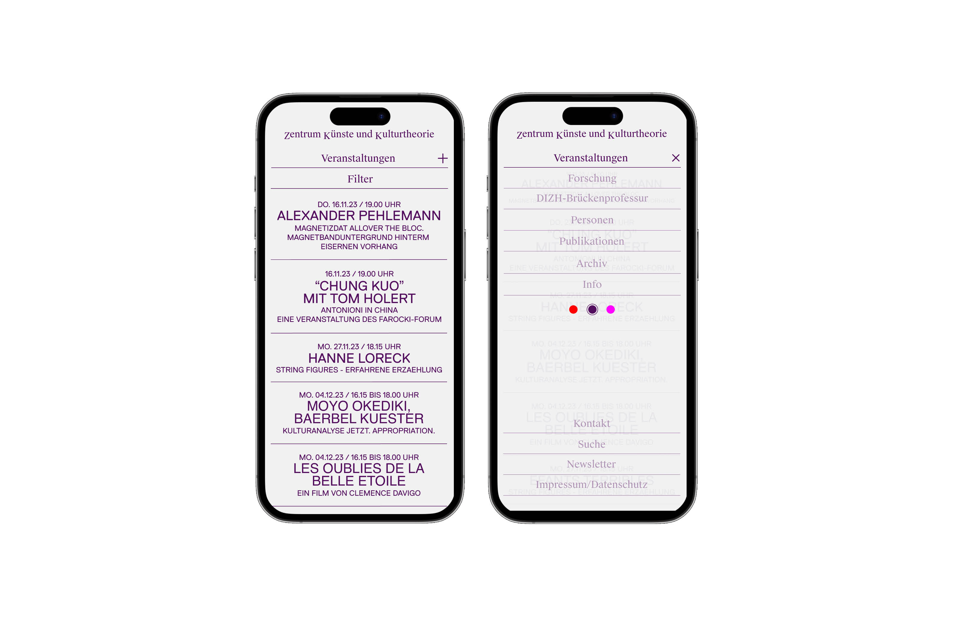
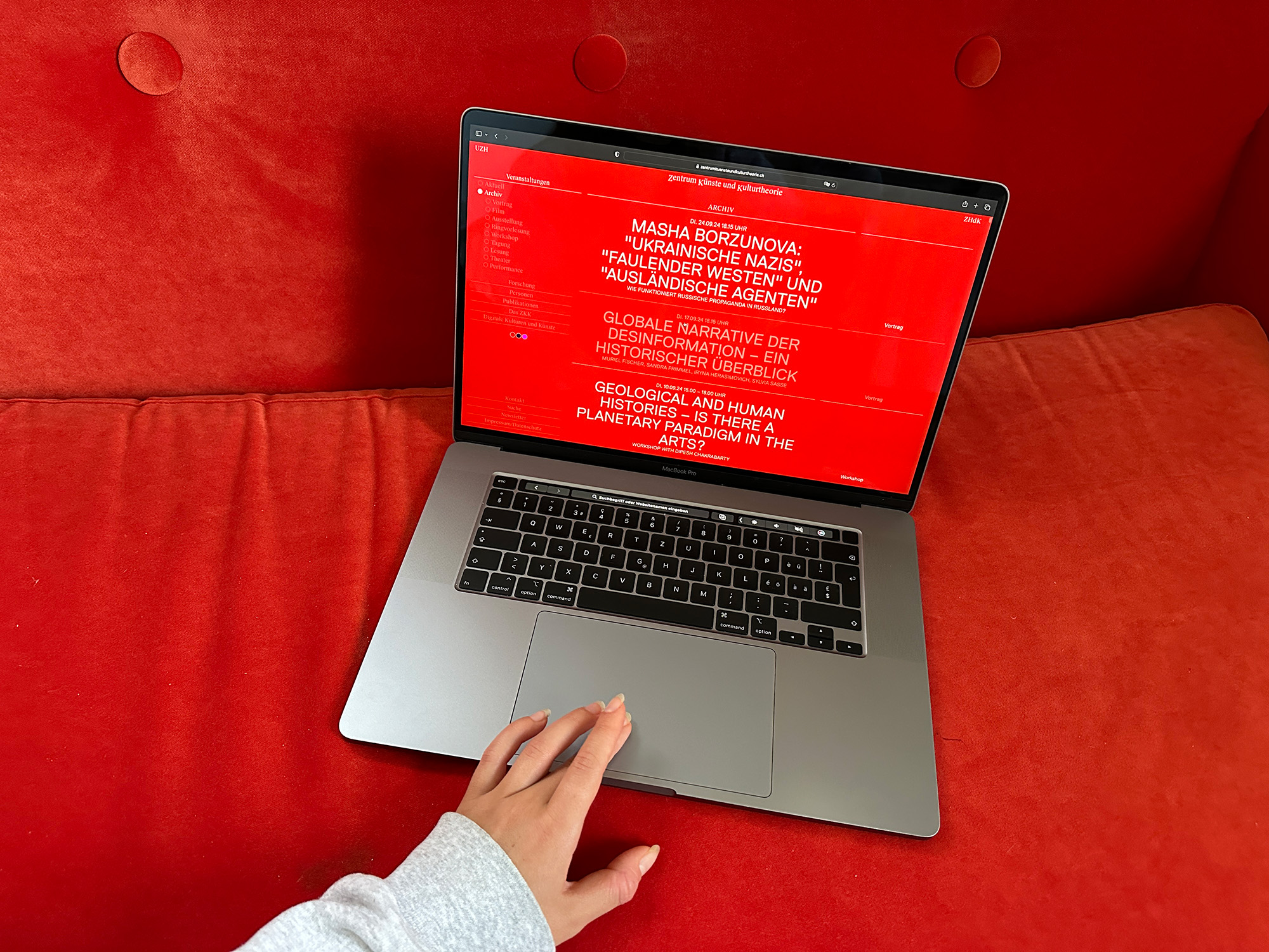
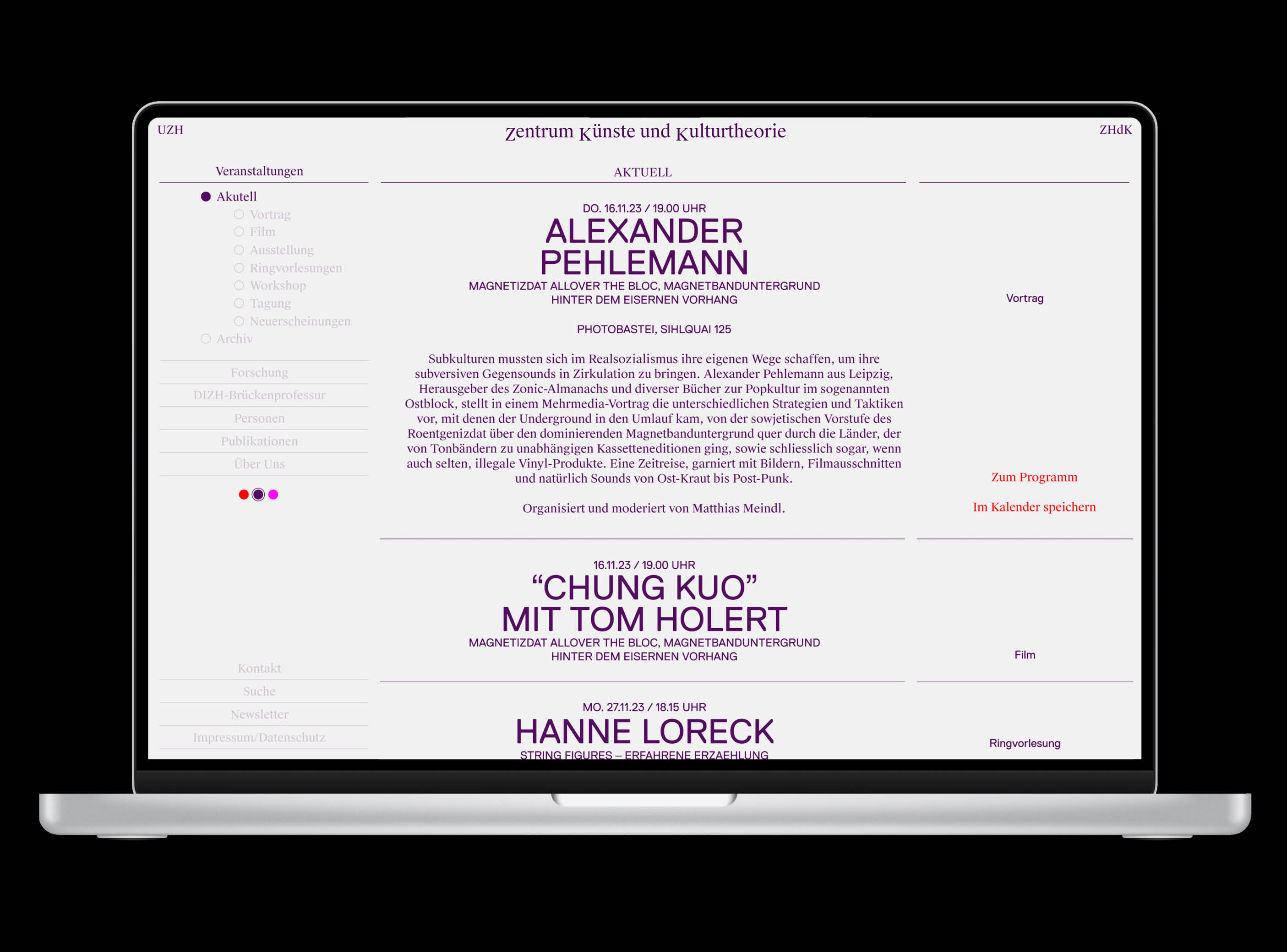
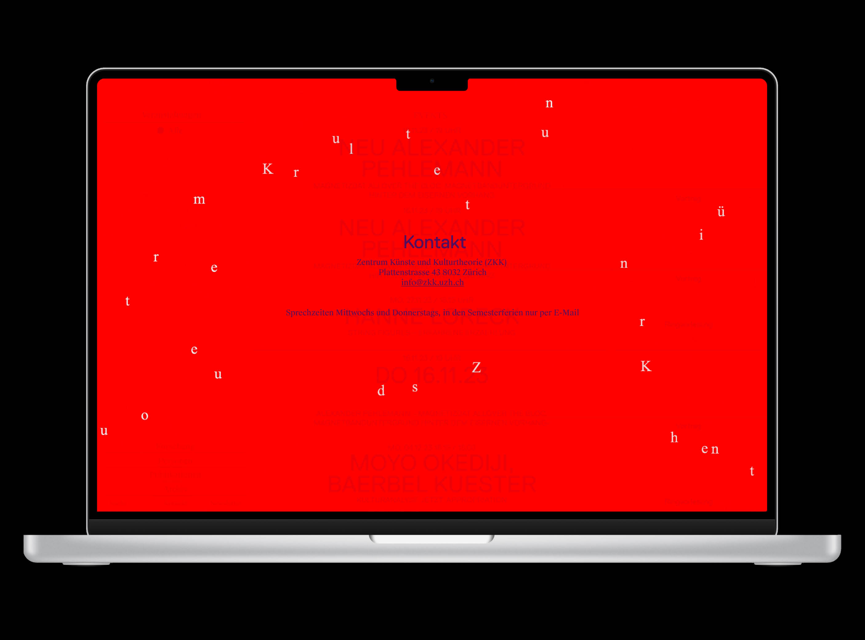
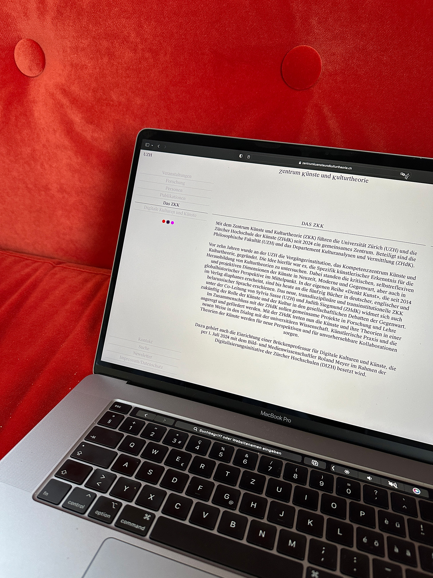
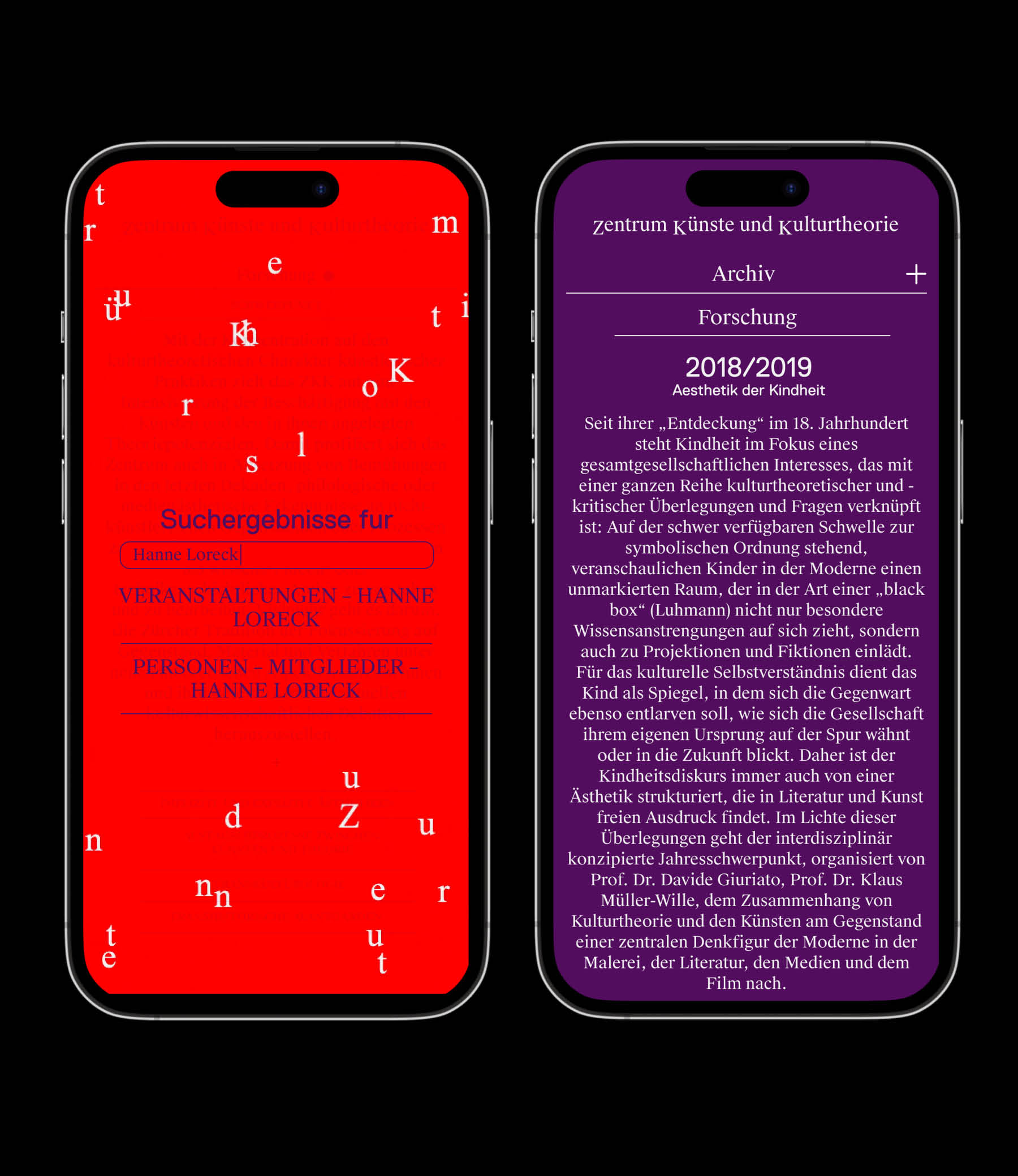
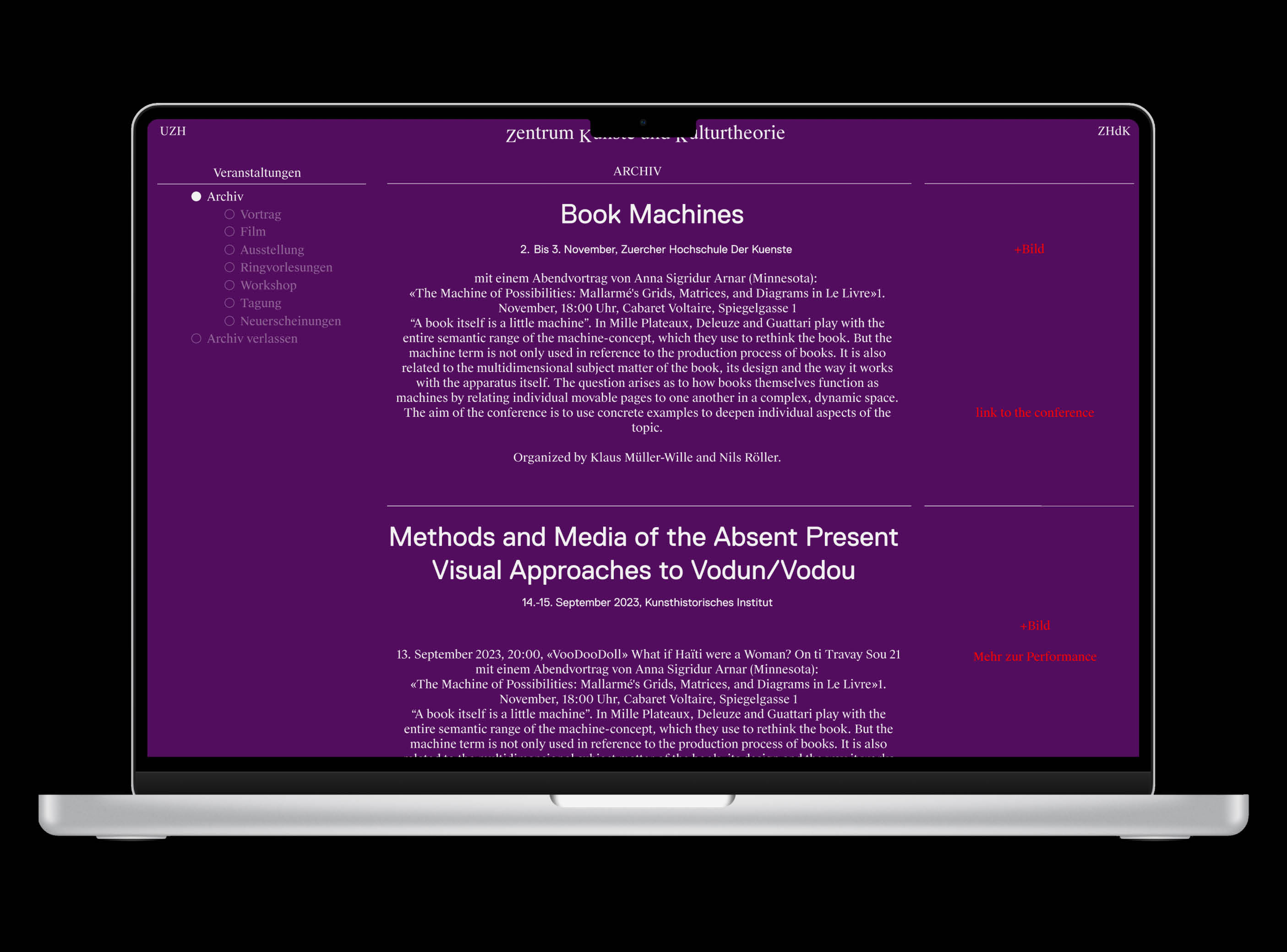
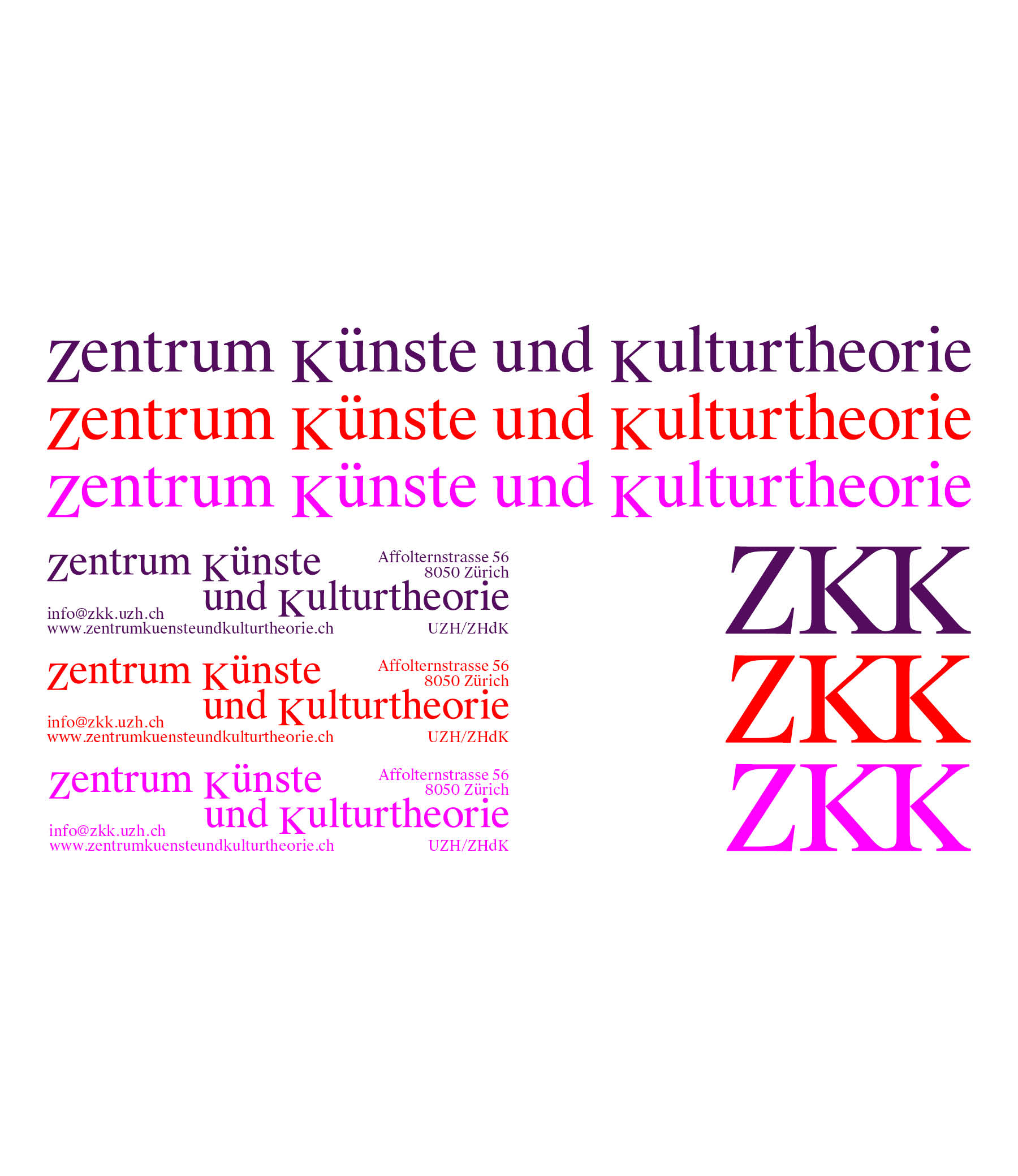
Since the Zentrum für Künste und Kulturtheorie (ZKK) became a joint institute between the Universität Zürich (UZH) and the Zürcher Hochschule der Künste (ZHdK), a redesign was due. The new logo works with the widely used abbreviation and the full form simultaneously. For the structure of the website we put the focus on the events organized by ZKK and invented a concept for the big amount of archive material. The centered layout visualizes the cooperation between UZH and ZHdK. A project together with Alicia Godel.
ZKK/ June 2024/ Website and Identity
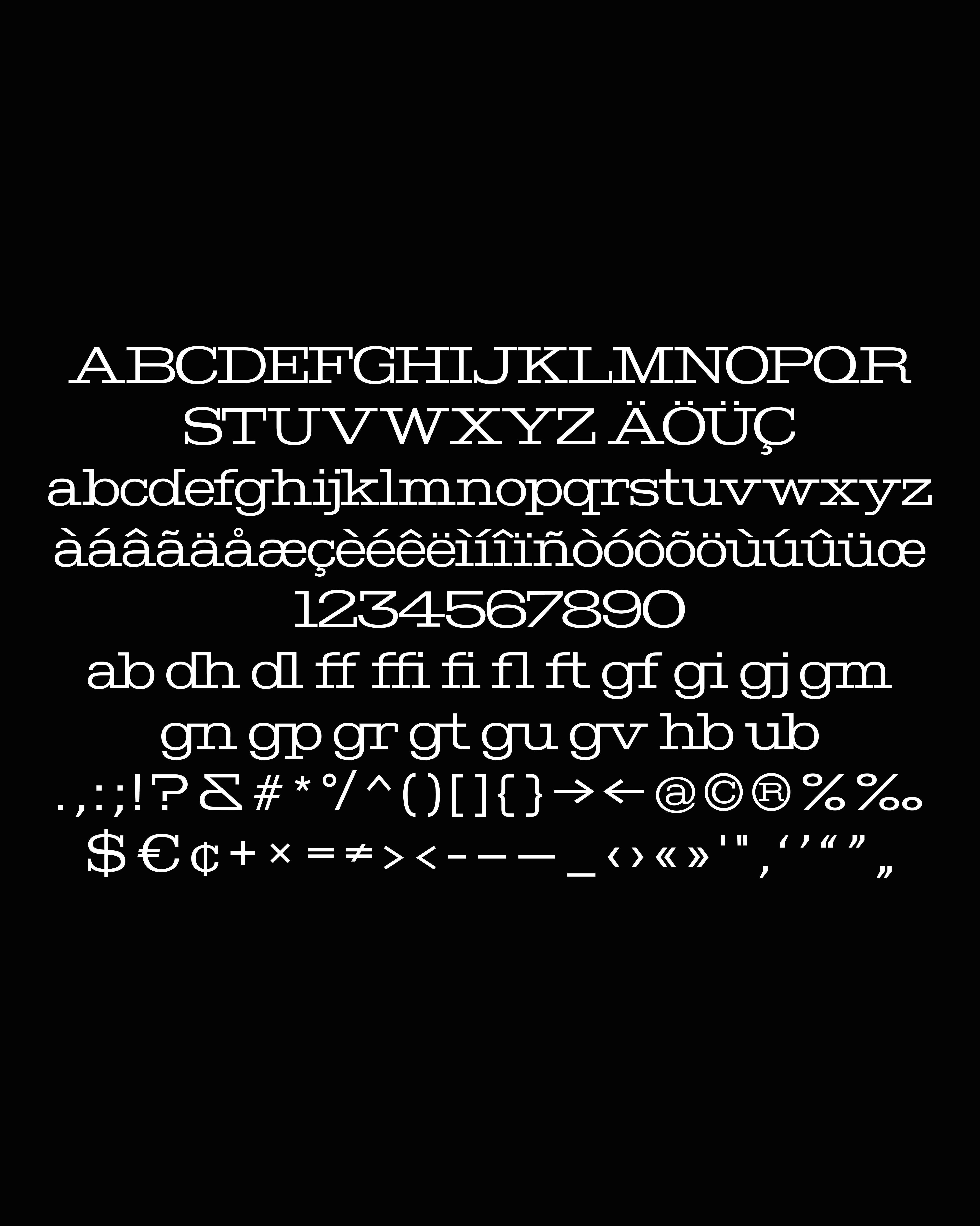
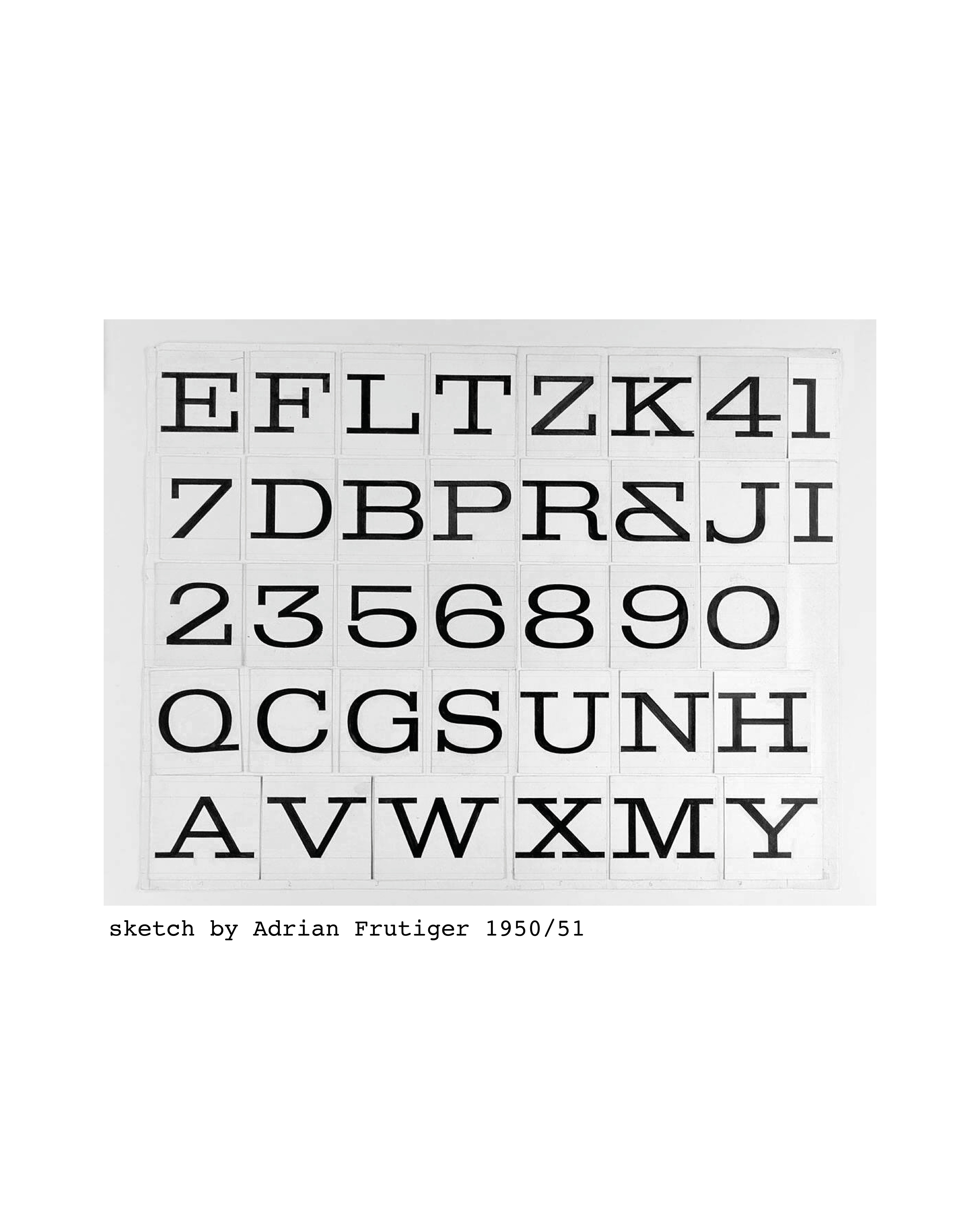
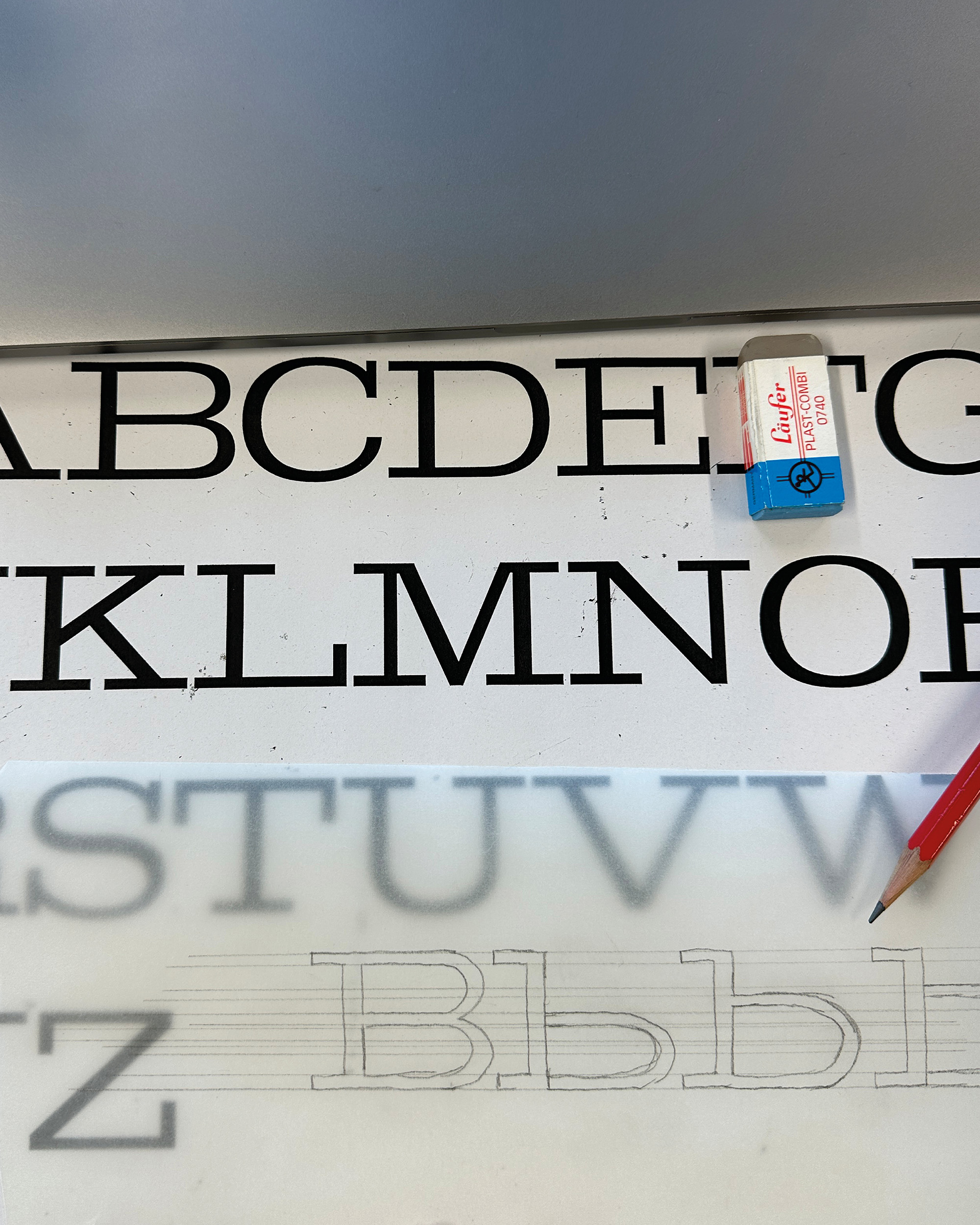
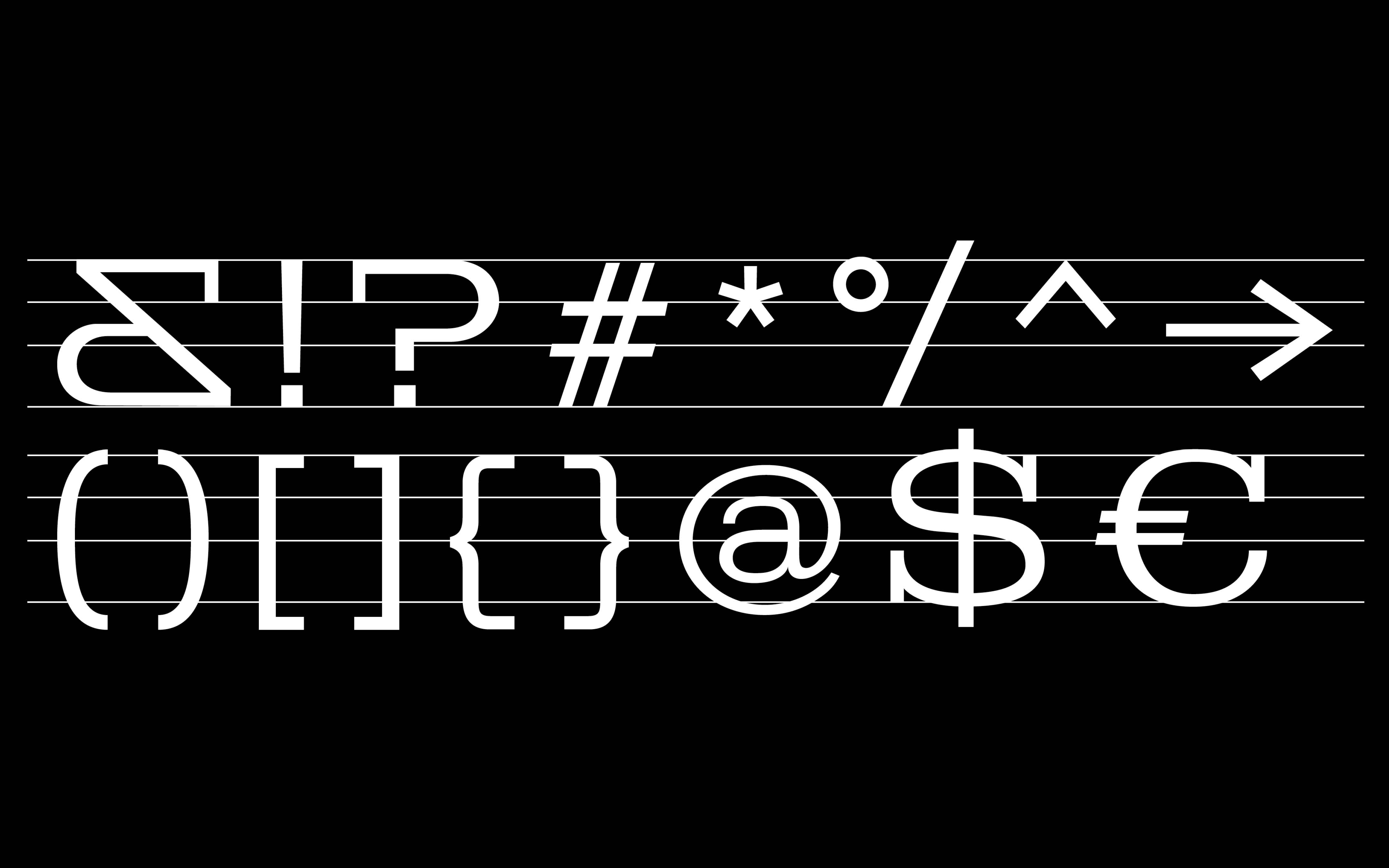
I was drawn to the wide, strong letters with extremely outstanding serifs in Adrian Frutiger’s early sketch. The strong impression as well as the curves and corners away from any conformity caught my attention. Fascinated by the unusual ampersand, pushing the shape to its limits, I began to understand the strokes, width and curves. Facing the challenges of a revival I digitized the given letters, transitioned to lowercases and added characters. In between Frutiger’s Legacy and my own design decisions, this font currently consists of 143 characters.
Bouygues WIP/ December 2023 – now/ Type Design
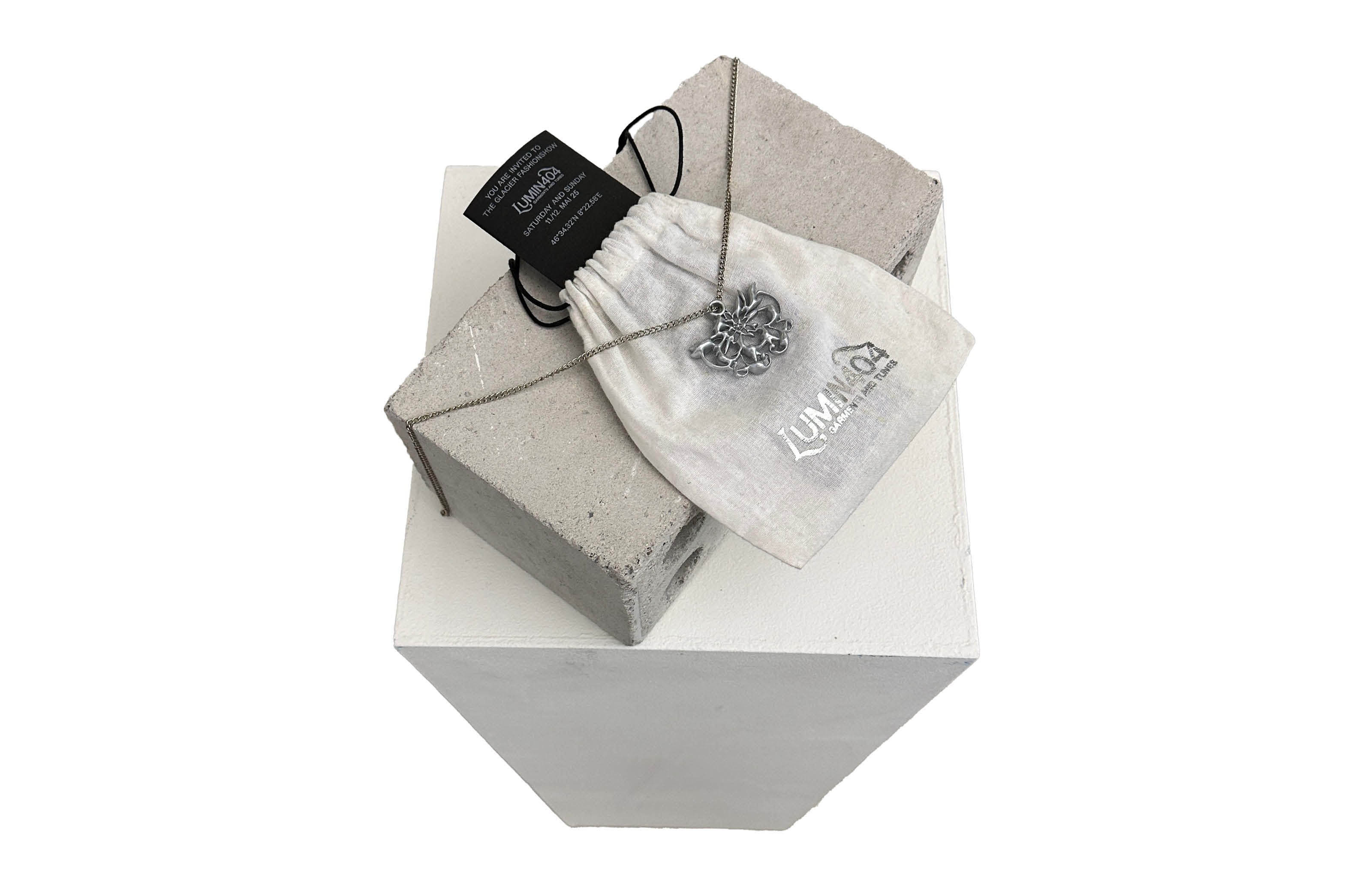
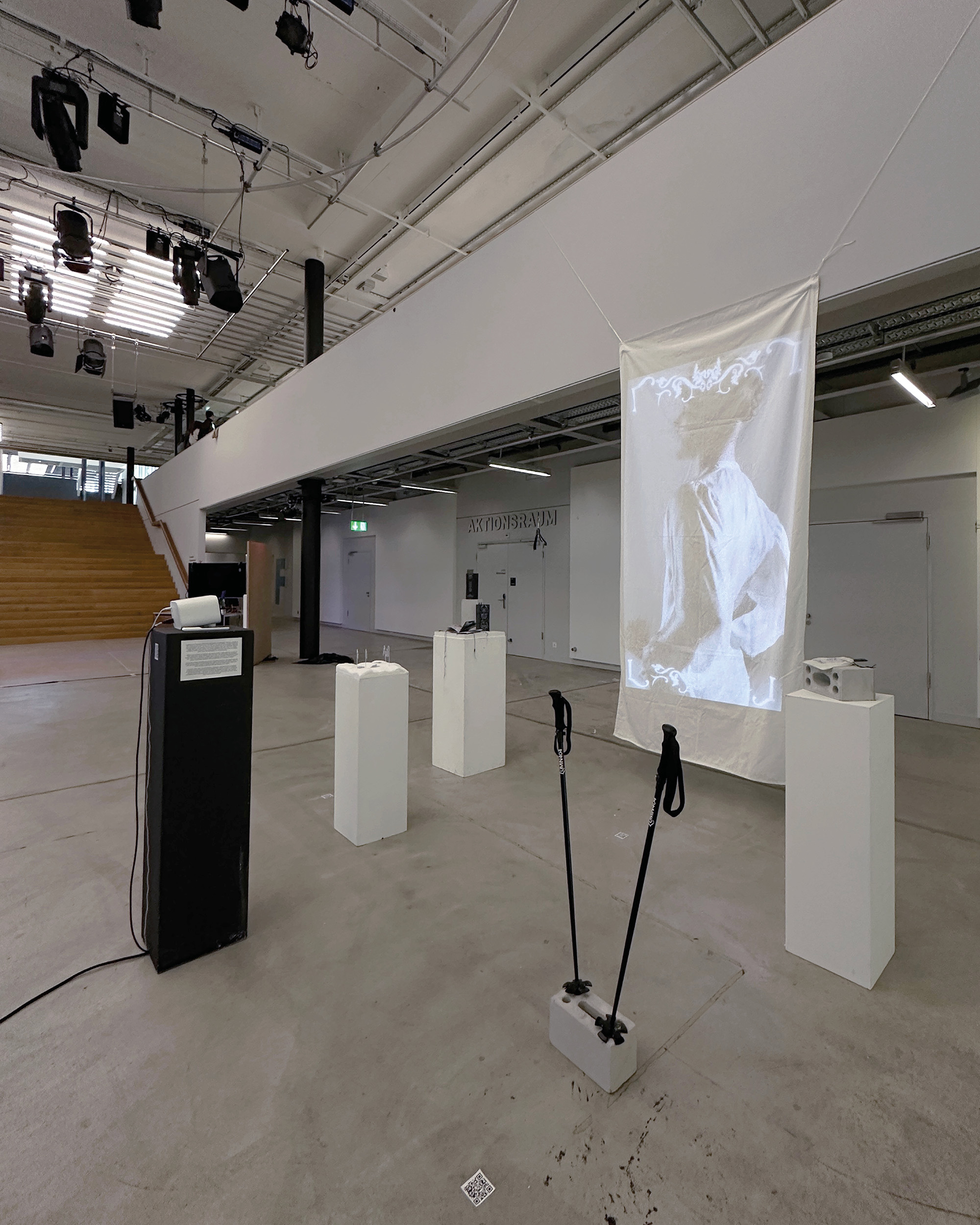
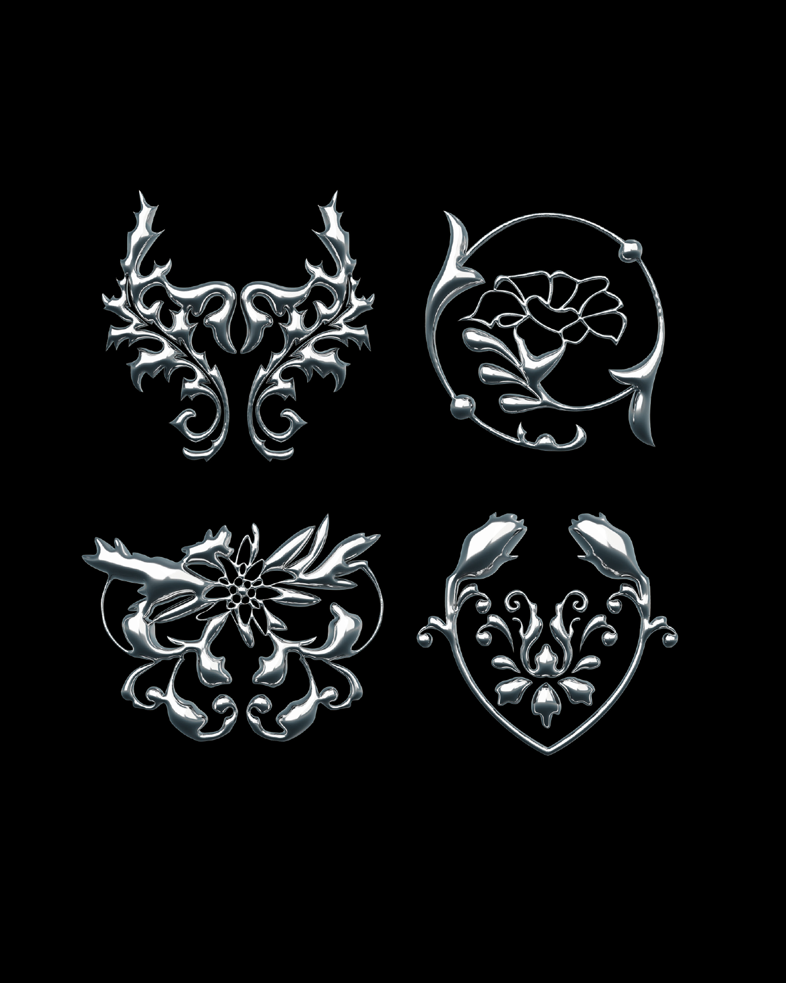

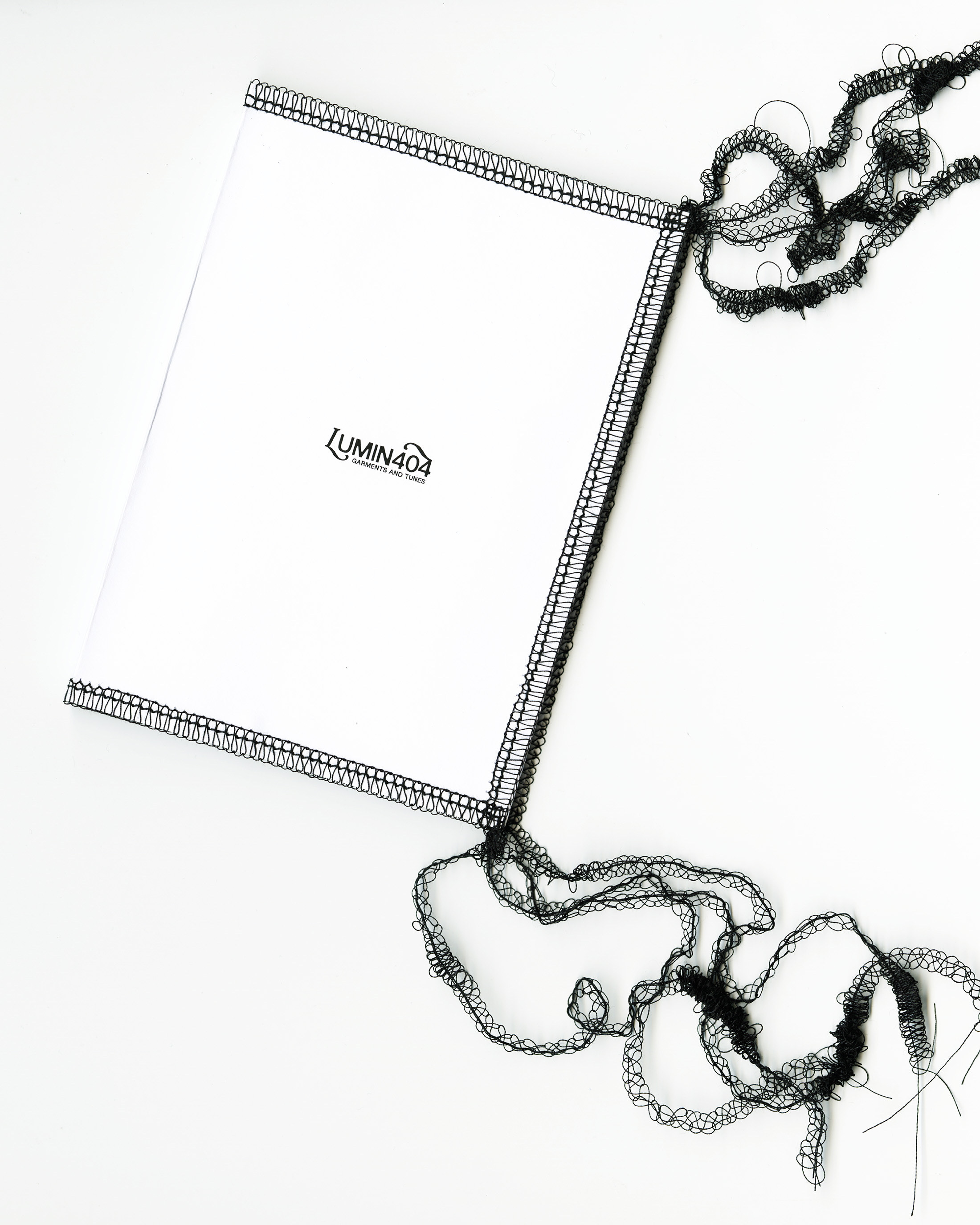
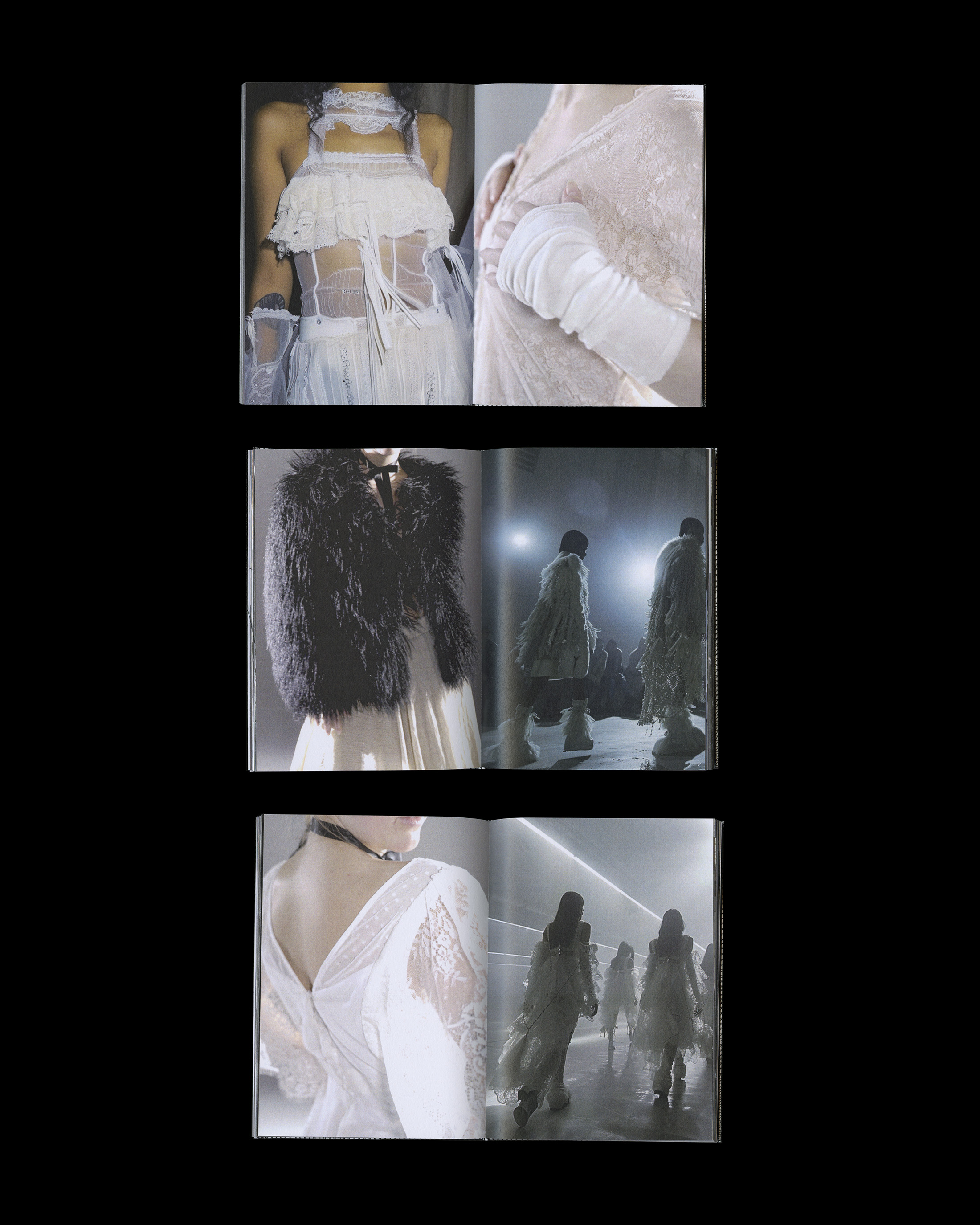
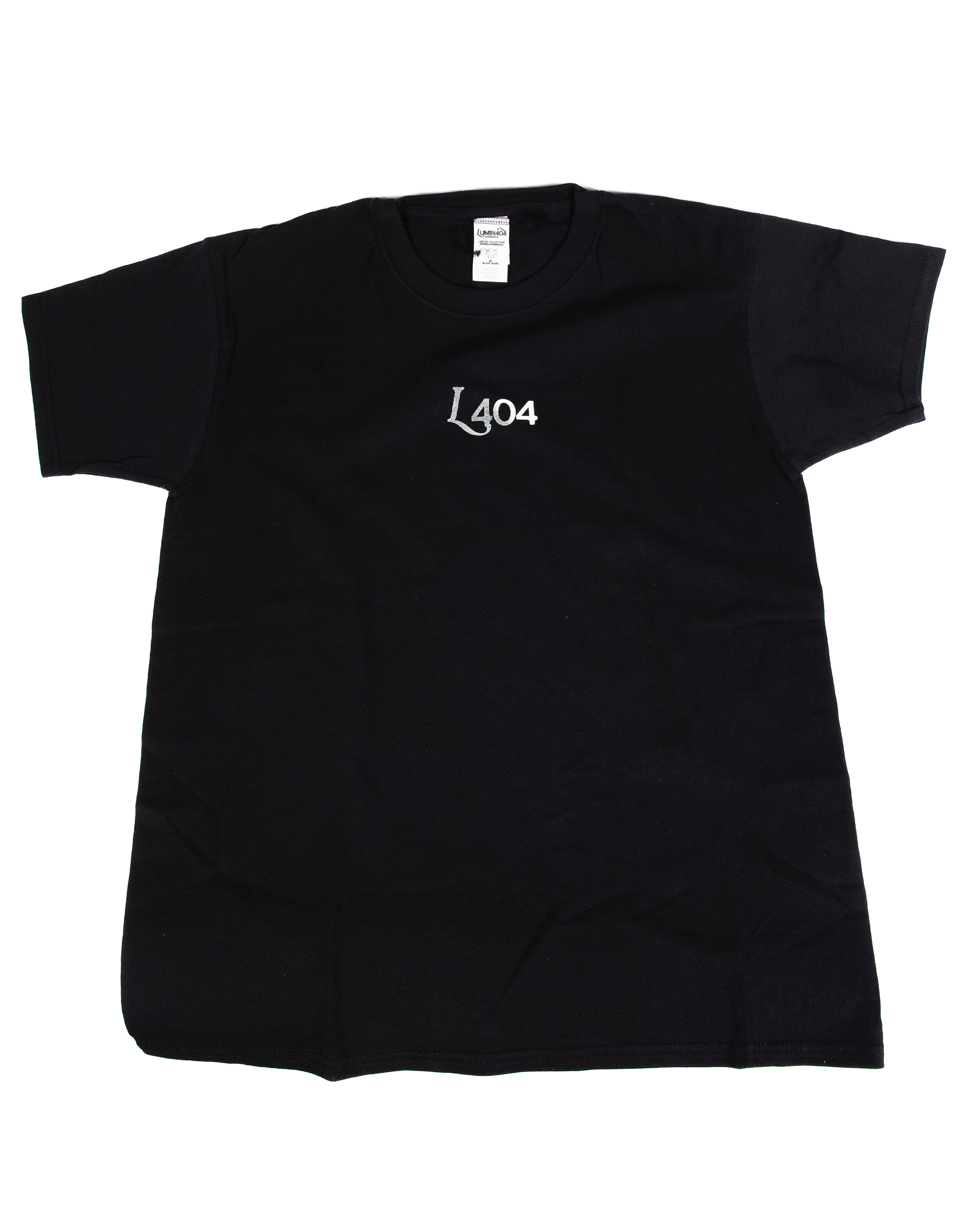
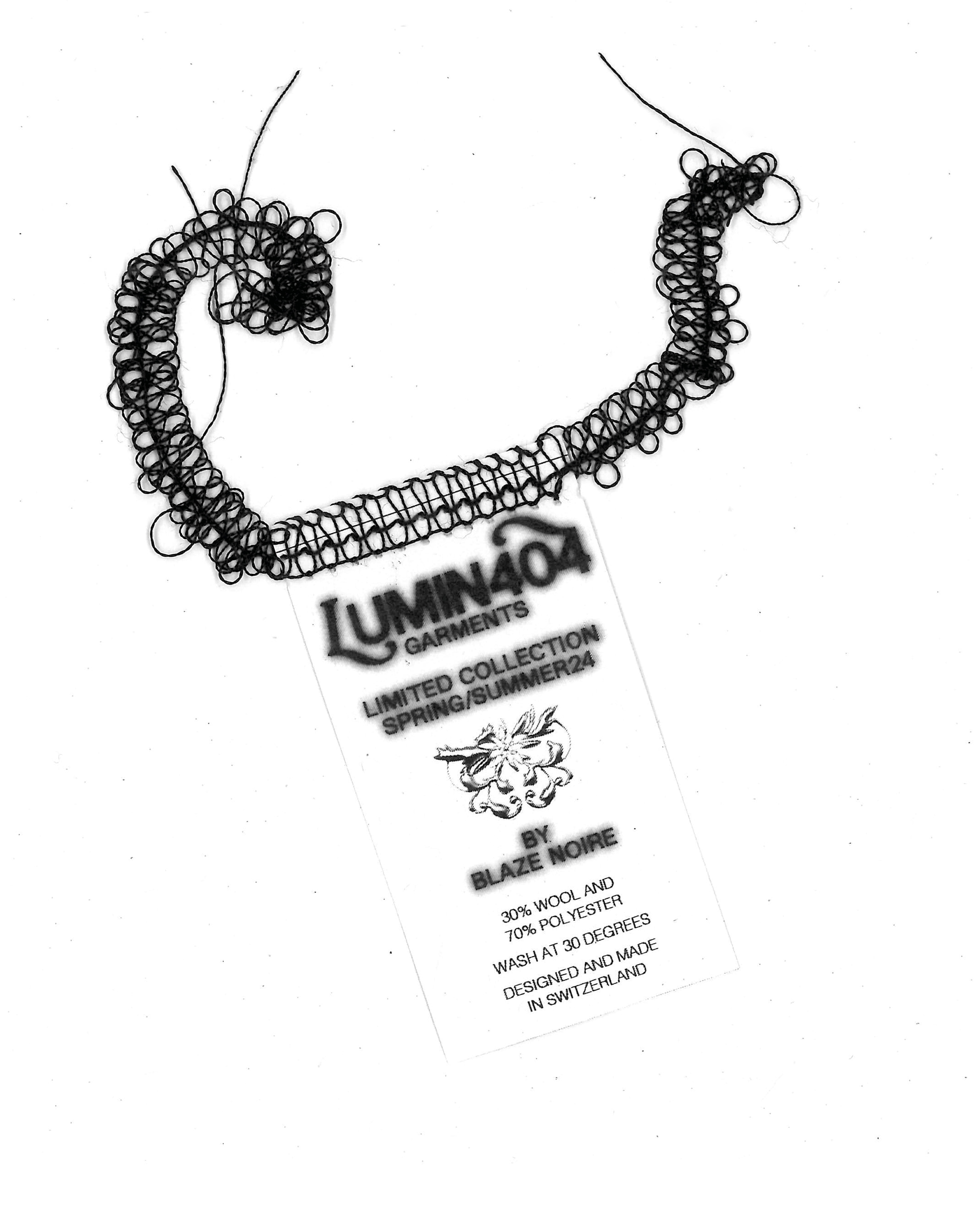
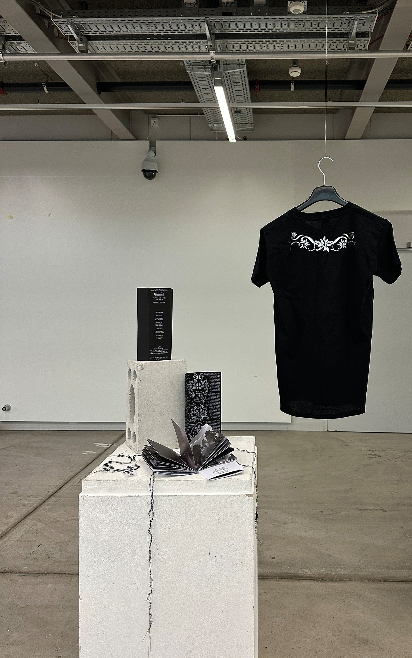
Using Chat Gpt as a starting point to create the Saga of „Lumina“, a mystical being and mascot of this fashion and music festival was born. For the launch of a fictional fashion collection in the Swiss alps we created the visual identity and several applications. Finally brought together in an exhibition, we showcased our multimedia work.
Interdisciplinary project together with Viviane Bettschart, Alexa Weiss and Luc Schweizer.
Lumin404/ March 2024/ Identity
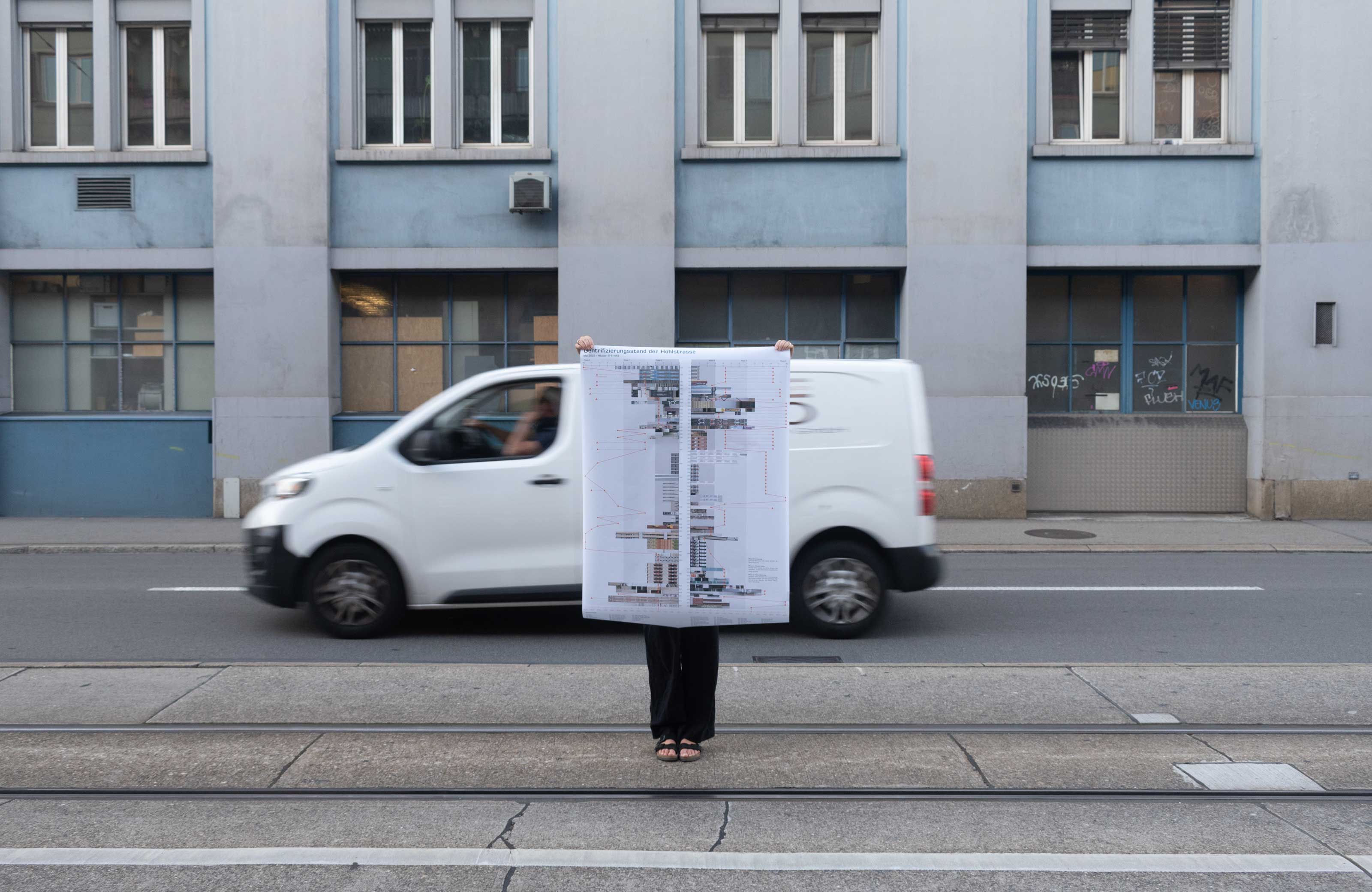
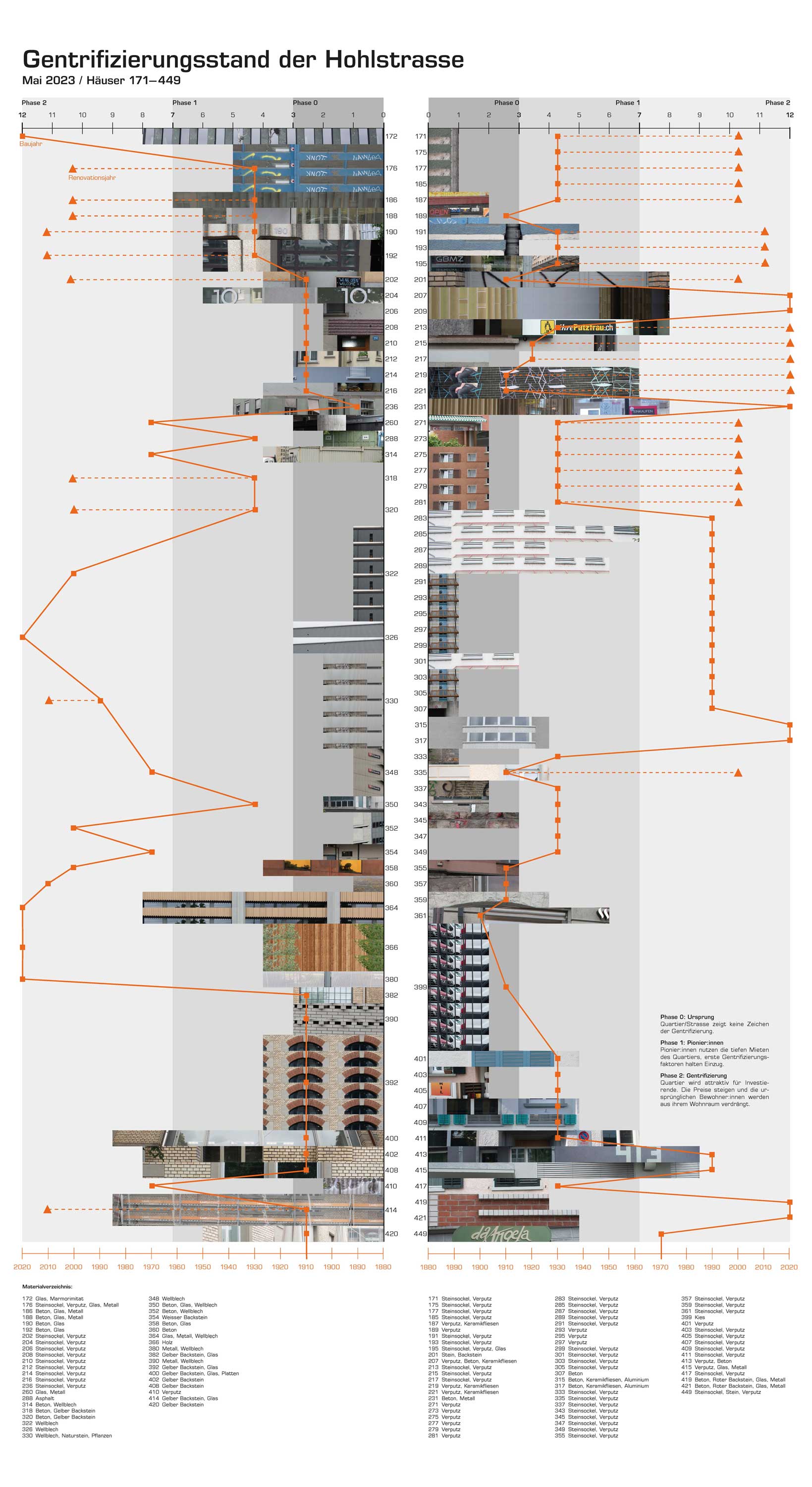
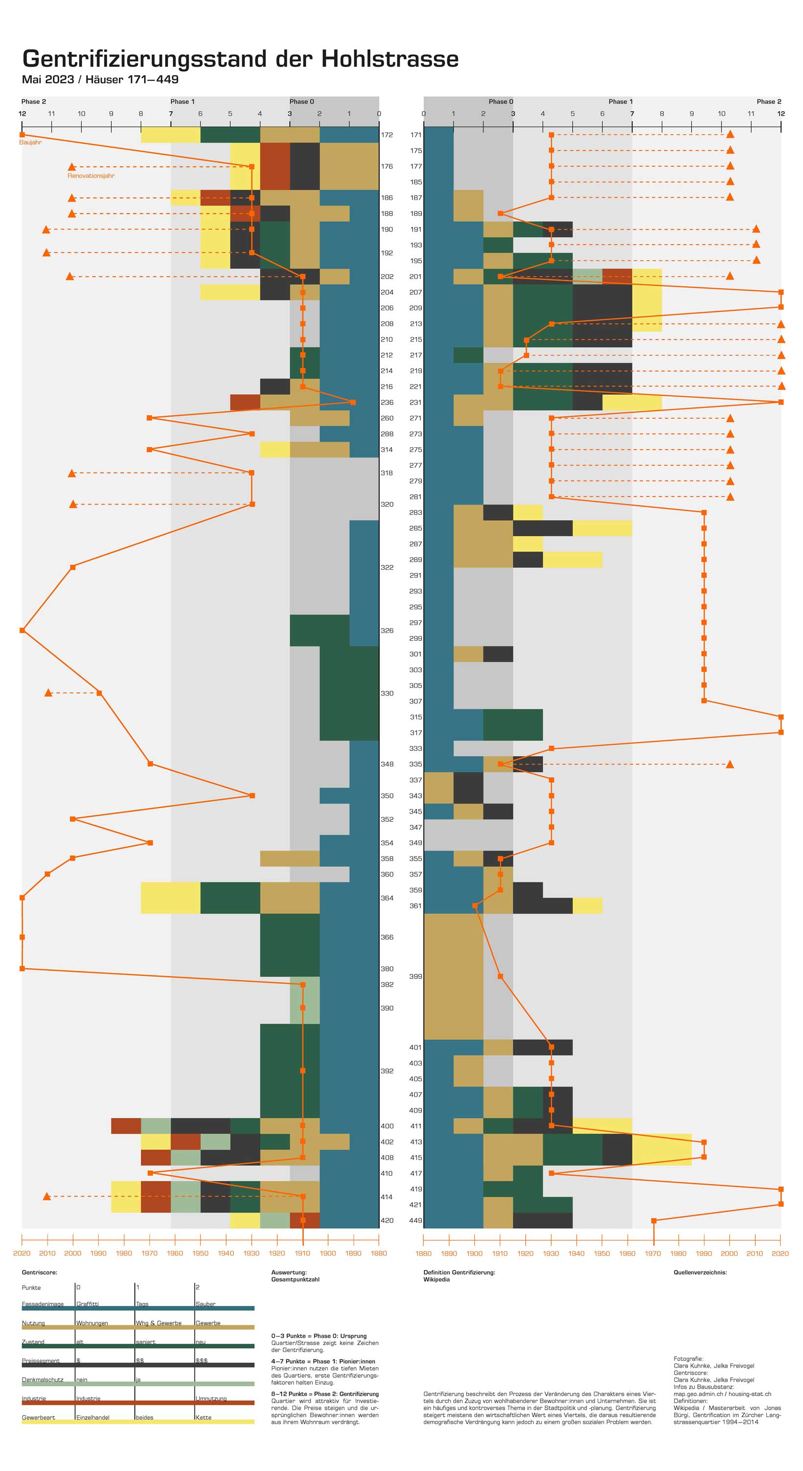
Starting with our own photographic and urban research, a point system was developed to assess the degree of gentrification of the buildings along the Hohlstrasse, Zürich. The resulting Gentri-score as well as additional photographic and historical data and a building index were presented in an informative poster. This project was created in collaboration with Jelka Freivogel.
Hohlstrasse 171 – 449/ May 2023/ Poster
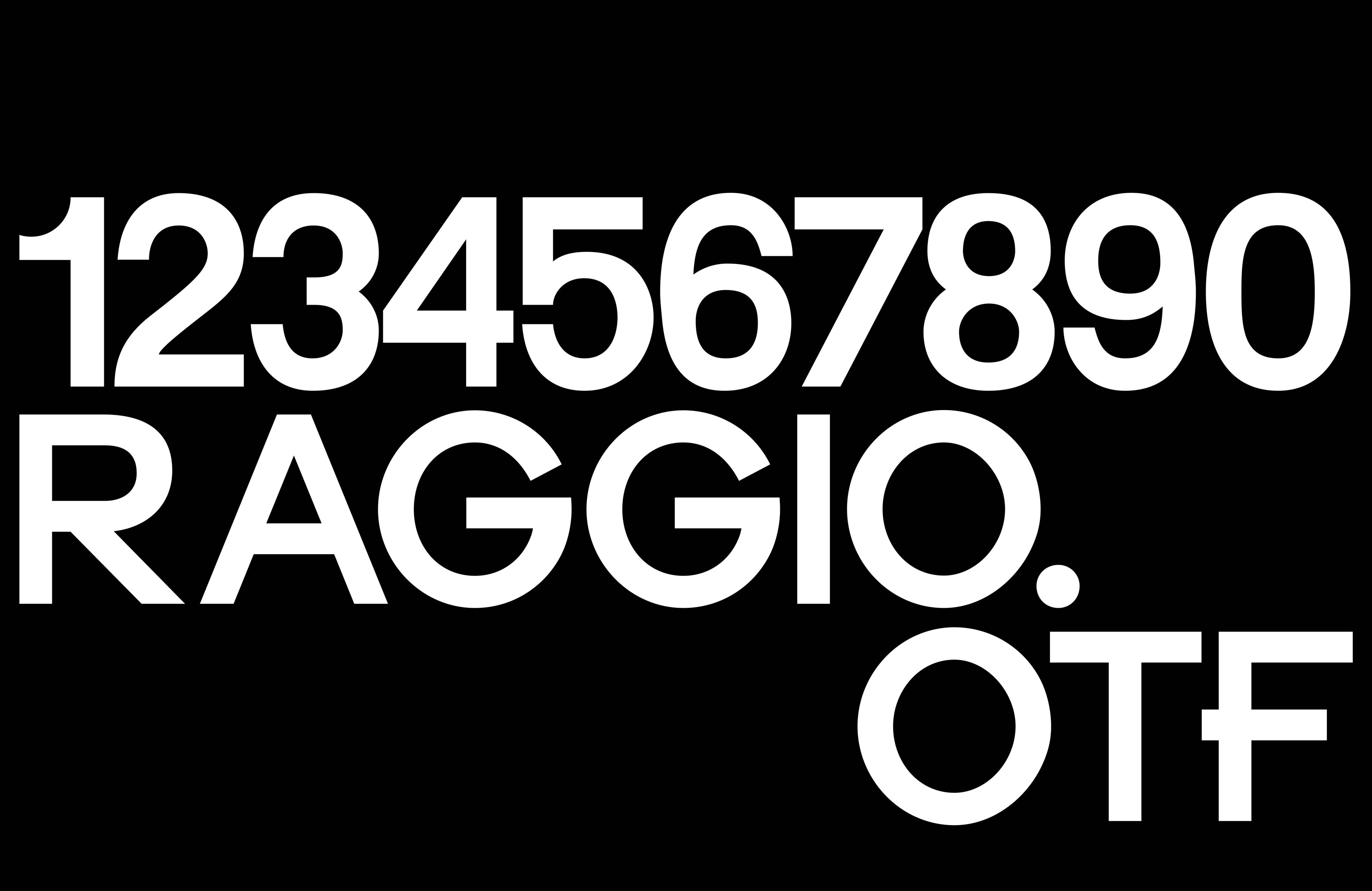
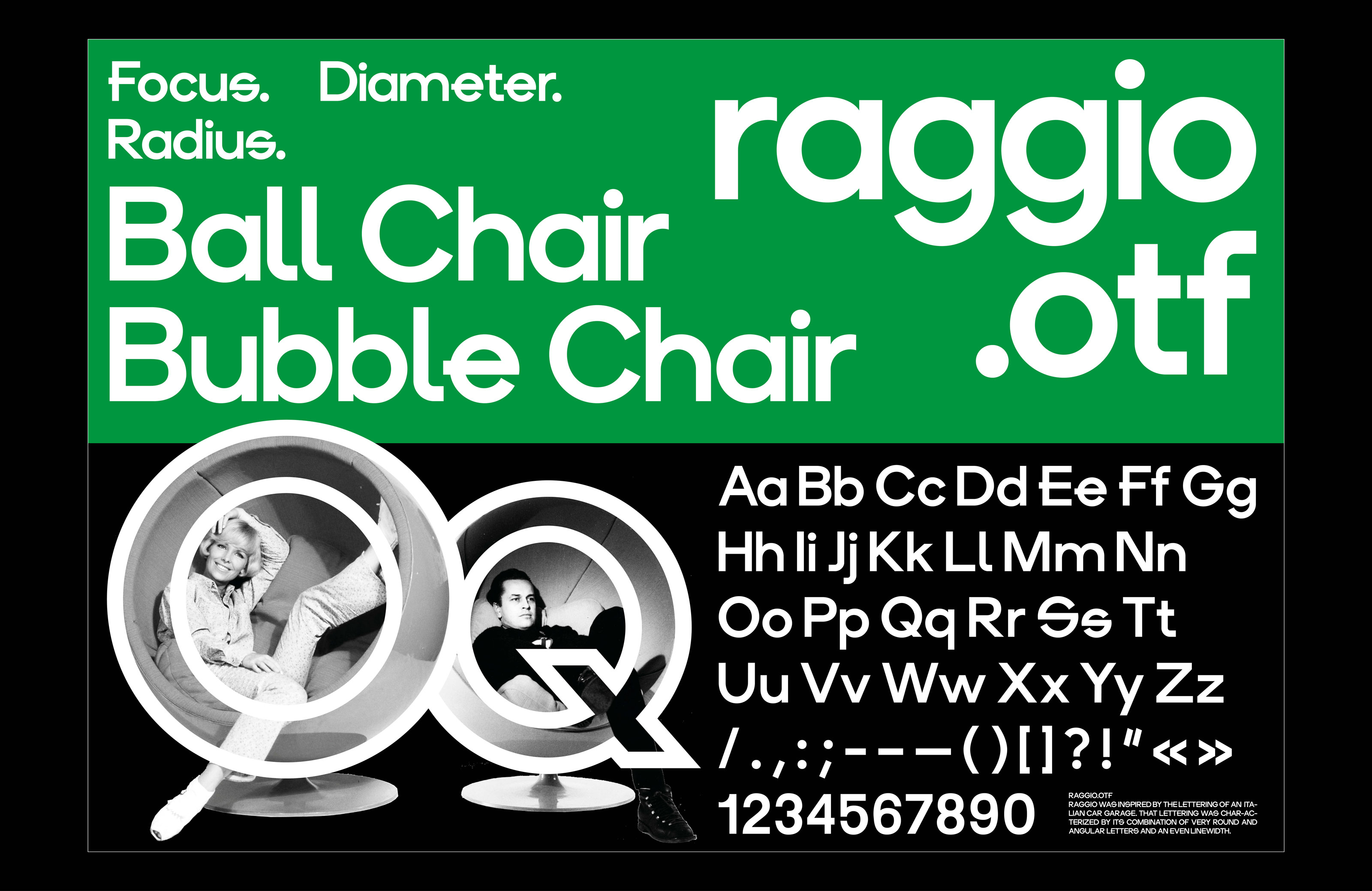
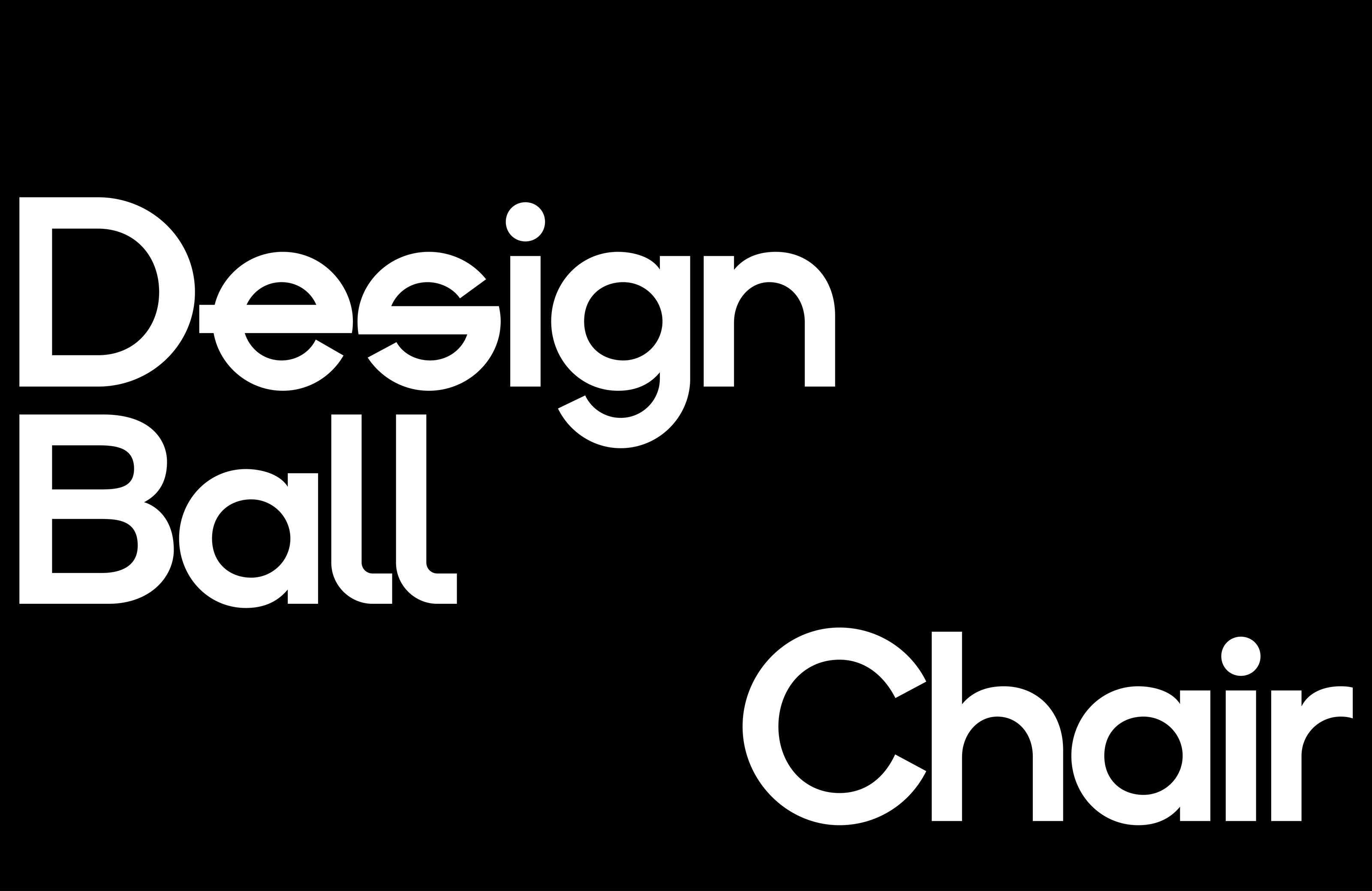
Raggio is inspired by the lettering of an italian Car Garage. The Lettering was characterized by its combination of very round and very angular letters. Therefore Raggio was designed around one of the simplest geometric shapes – the Circle – resulting in a geometric/constructed sans serif with an even line width.
Raggio.otf/ May 2023/ Type Specimen
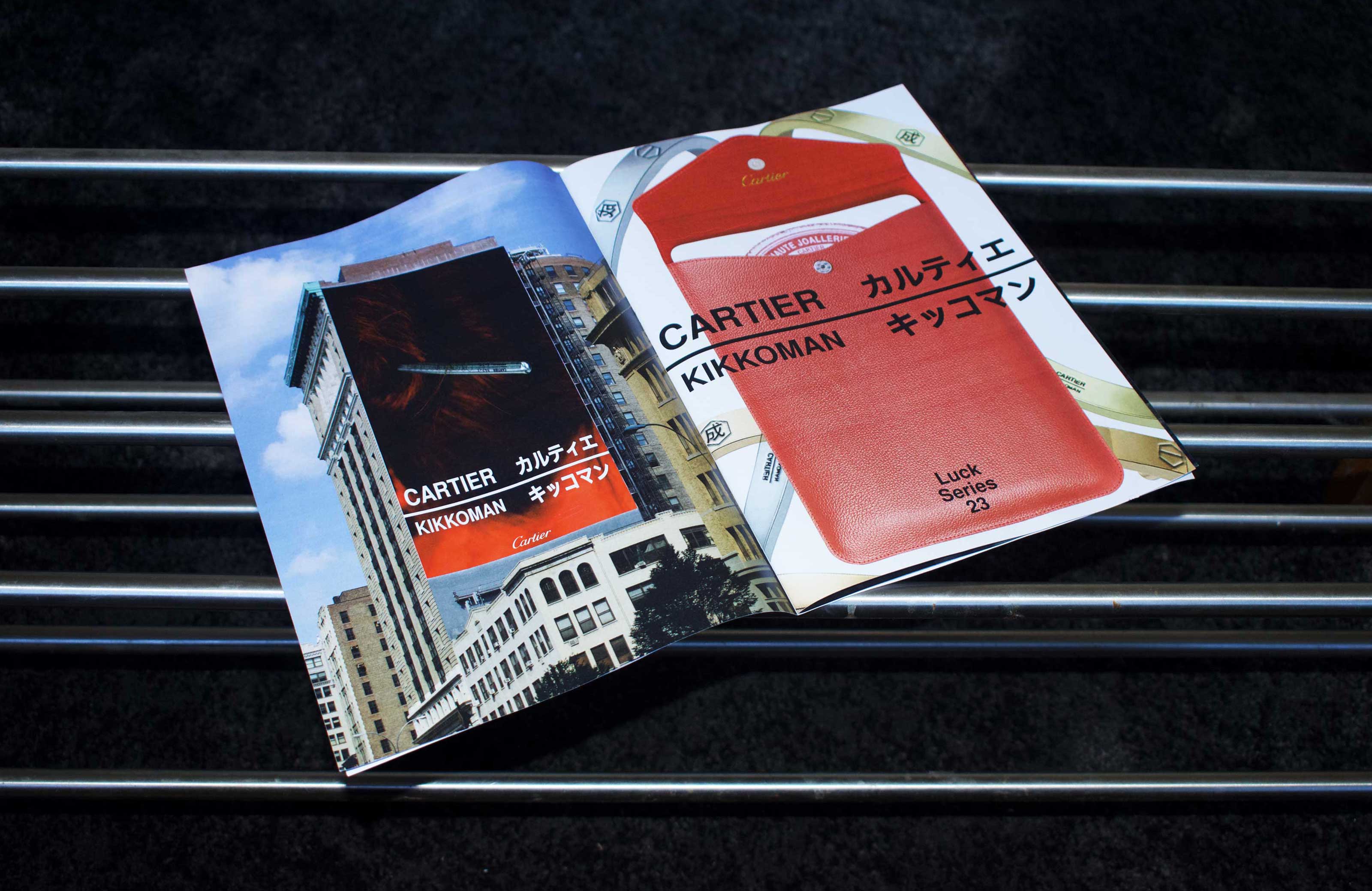
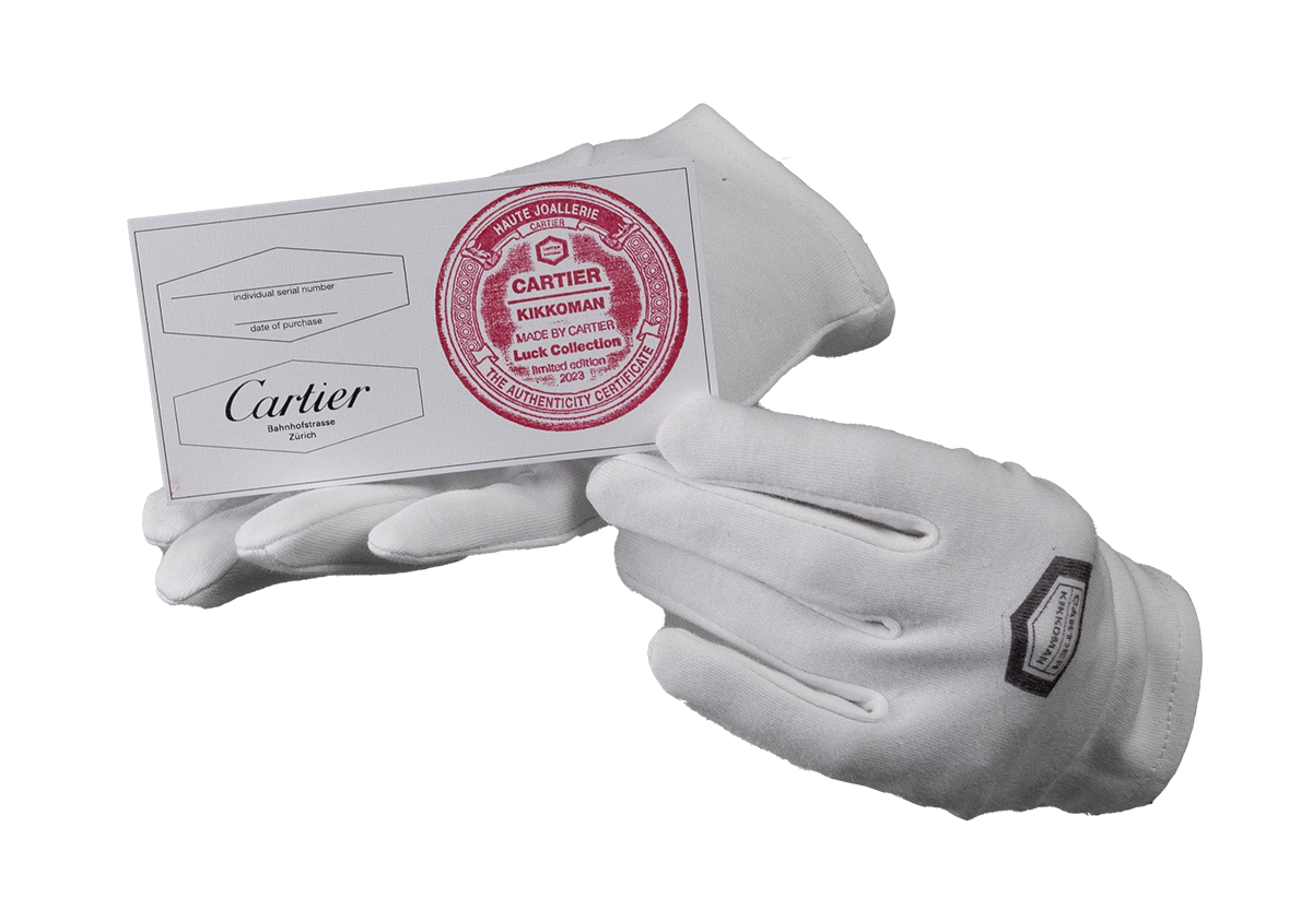
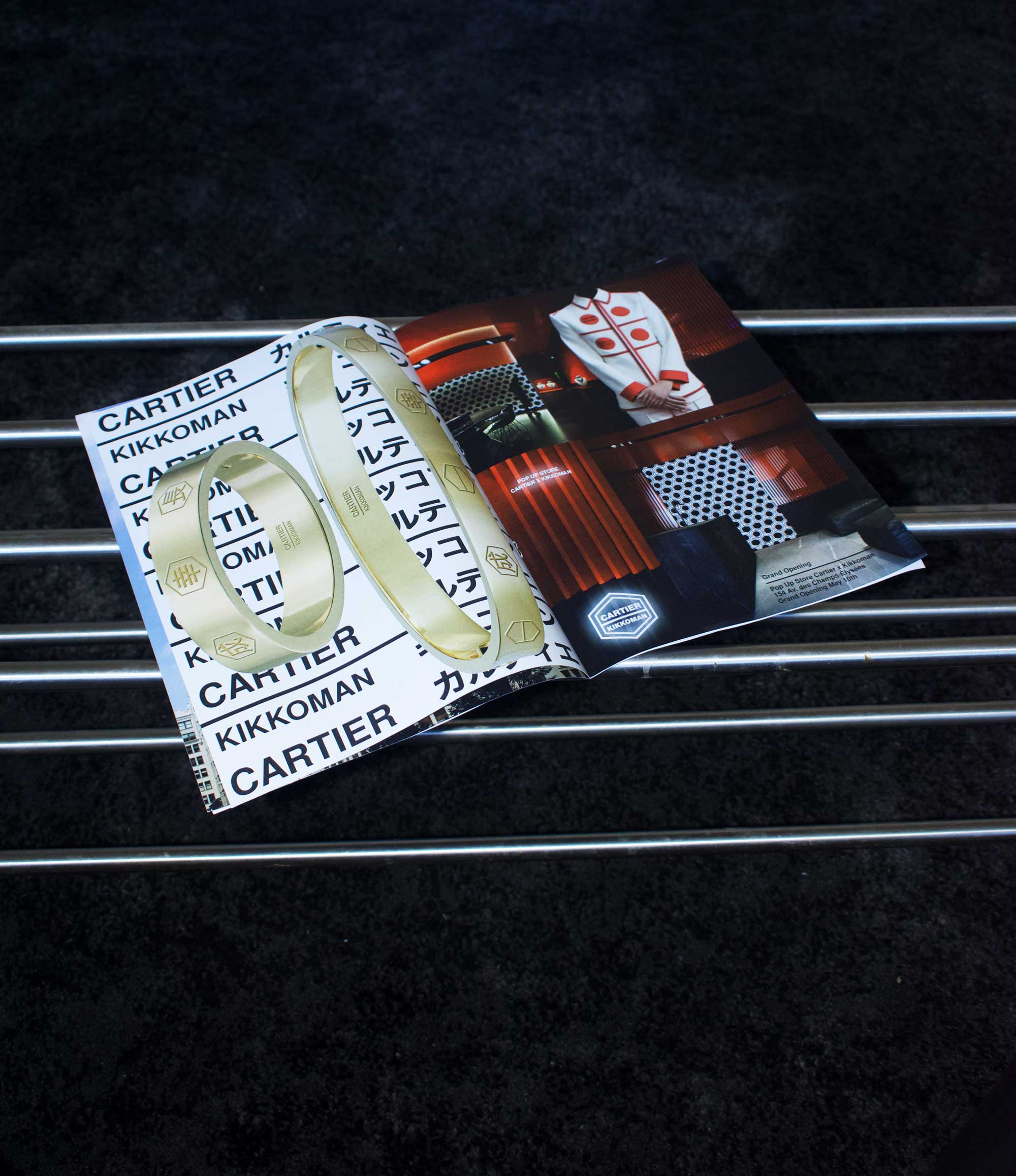
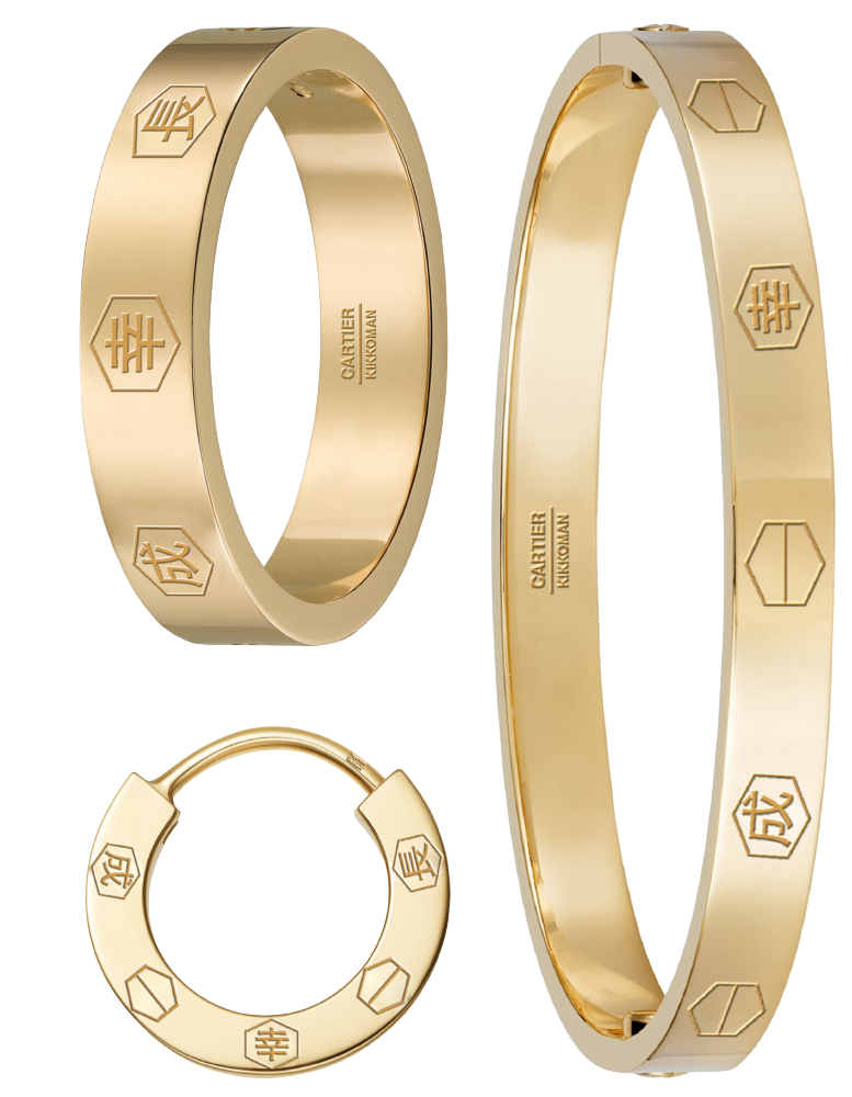
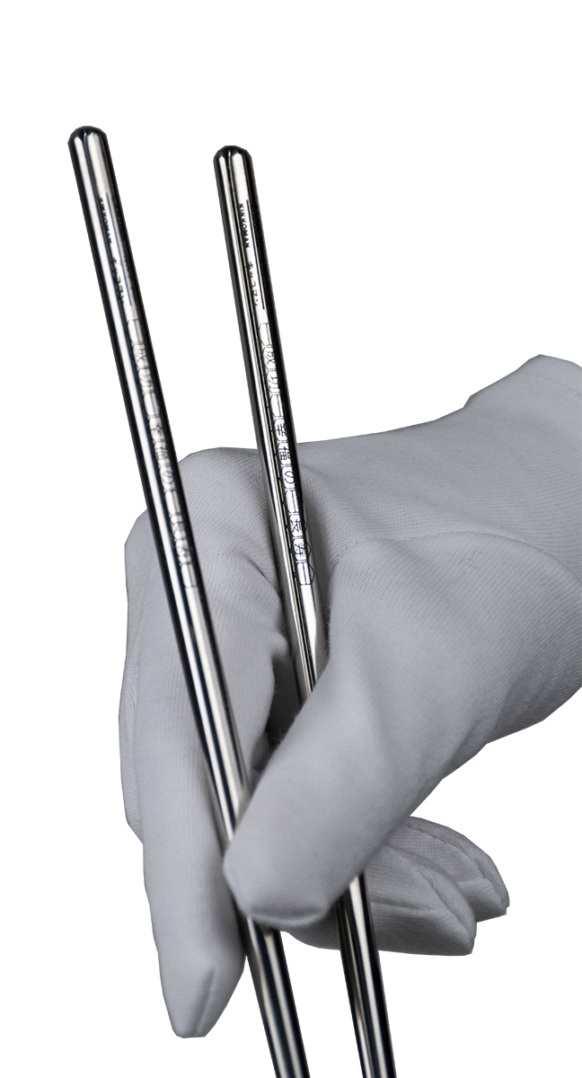
What would happen if two brands from completely different industries collaborated? You would need a collaboration logo, a product, a strategy and a store – a visual identity. In the fictional collaboration between Cartier and Kikkoman the common strategy was found in three core values – success, luck and durability. The apperance of the Luck collection is based on the hexagonal shape in the Kikkoman logo.
Cartier×Kikkoman/ May 2023/ Magazine Ads
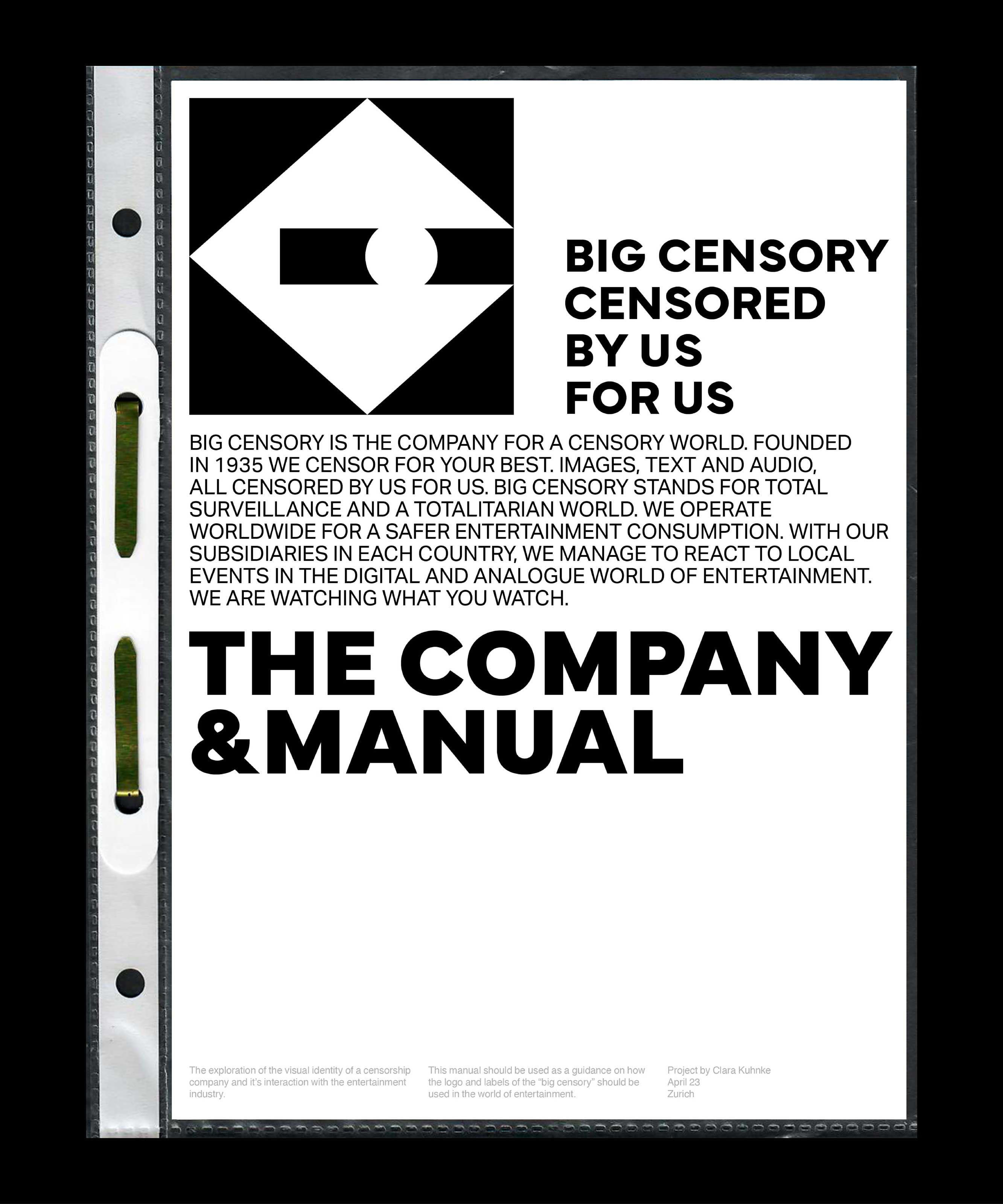
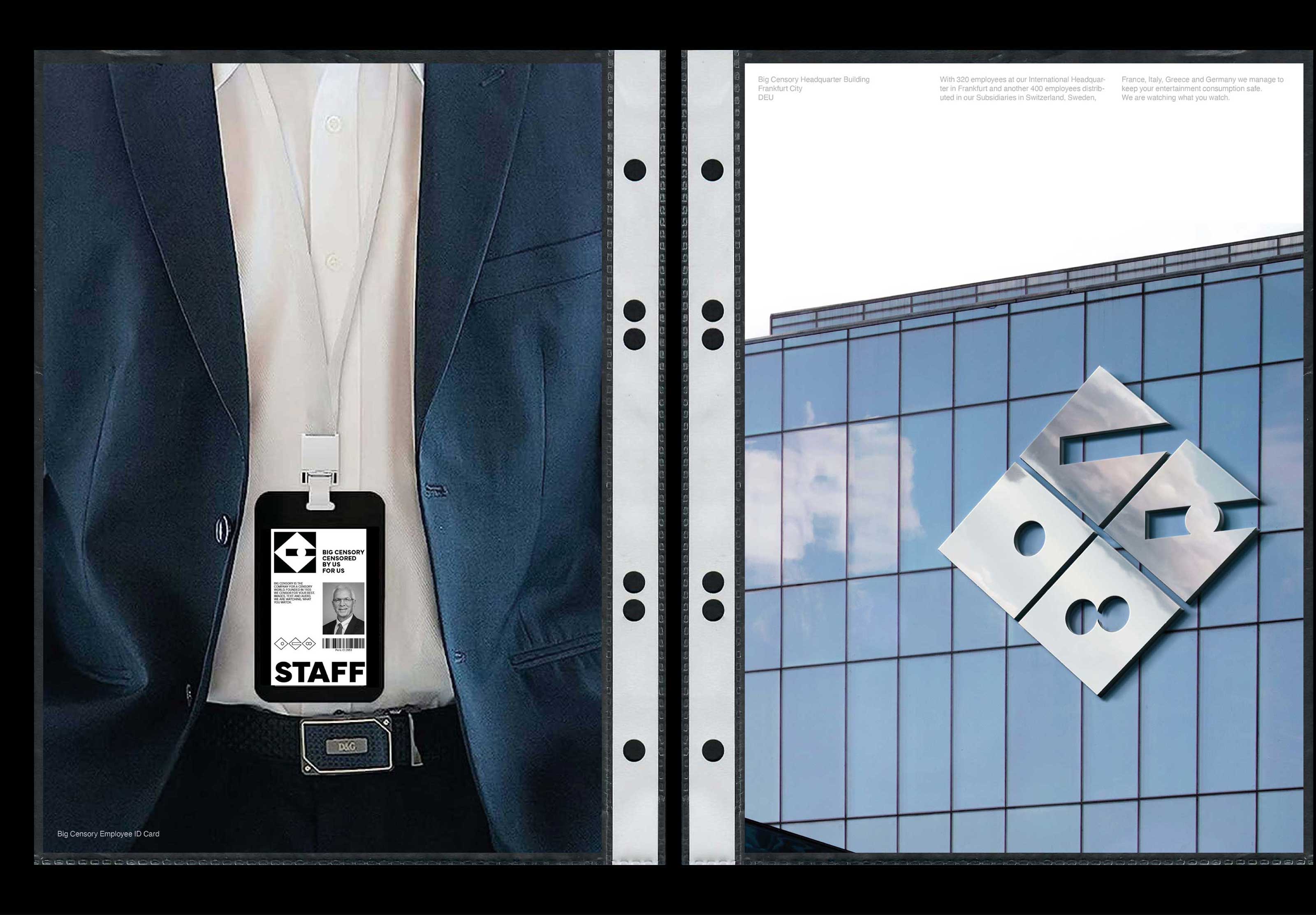
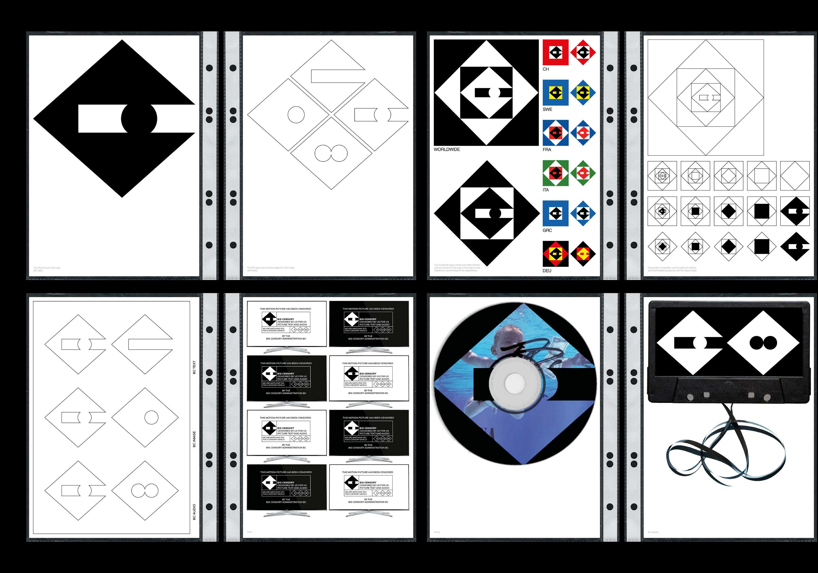
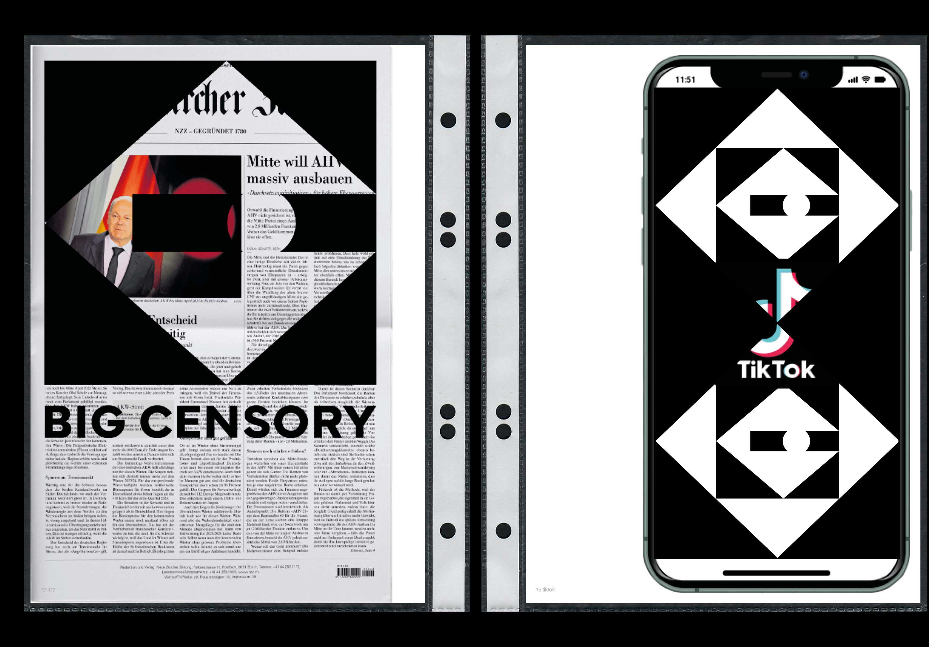
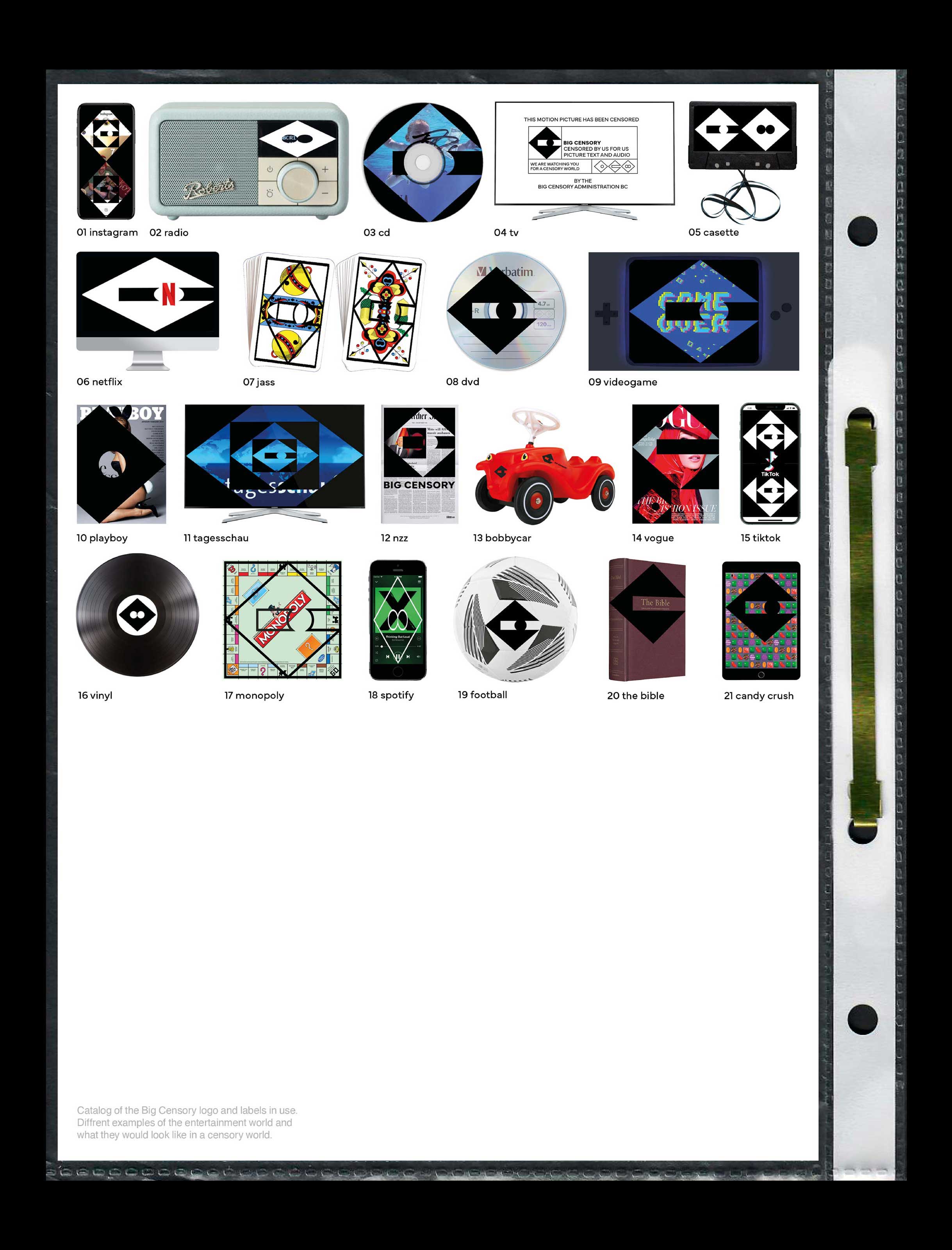
Censorship, a system that already exists but could be taken much further. What might total censorship in the entertainment sector look like? The invention of «The Big Censory» aims to answer this question. It is a visual experiment that resulted in a logo, a character set for audio, images and text as well as cases of use in various areas of the entertainment world.
Big Censory/ June 2023/ Booklet
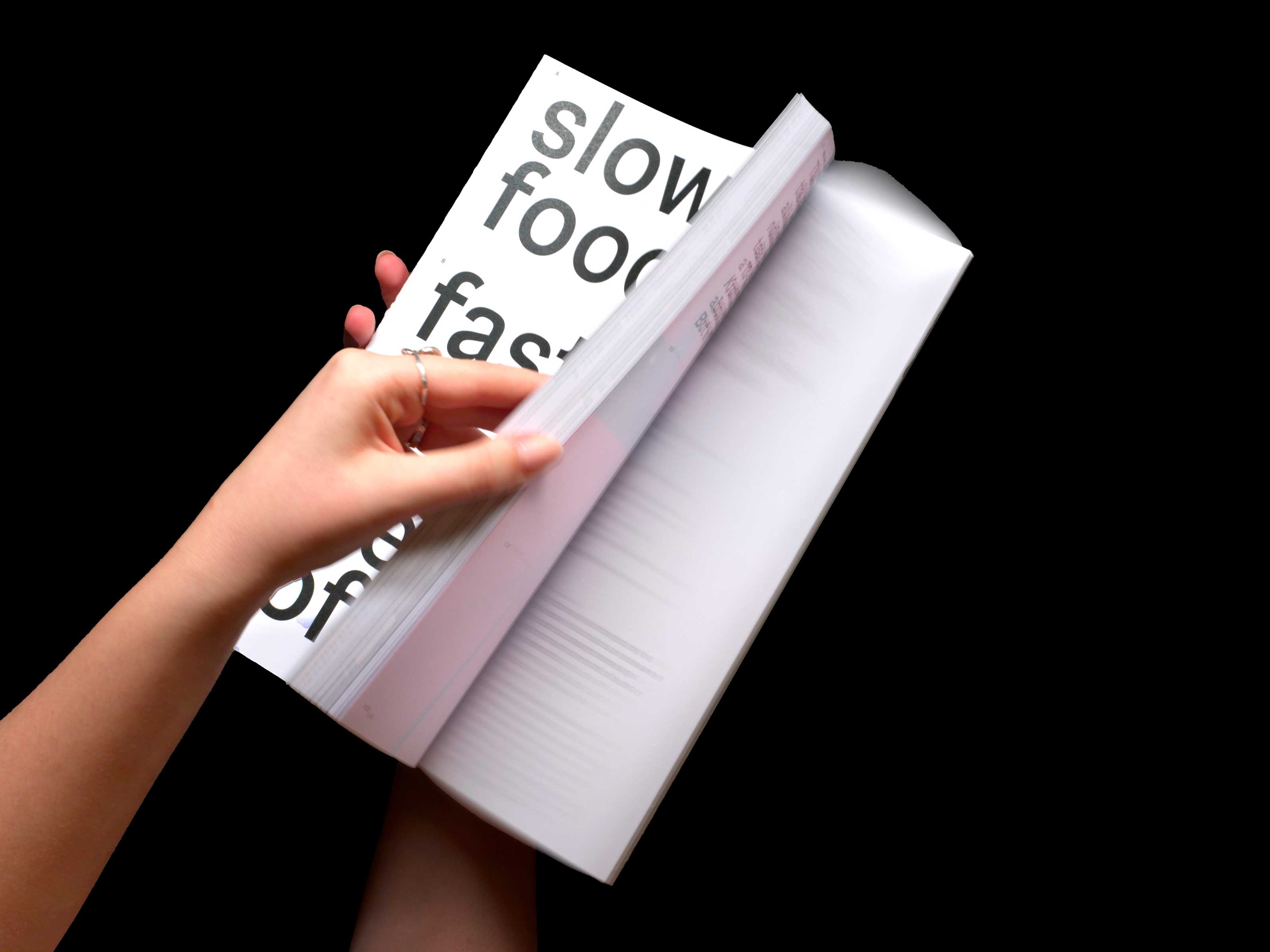
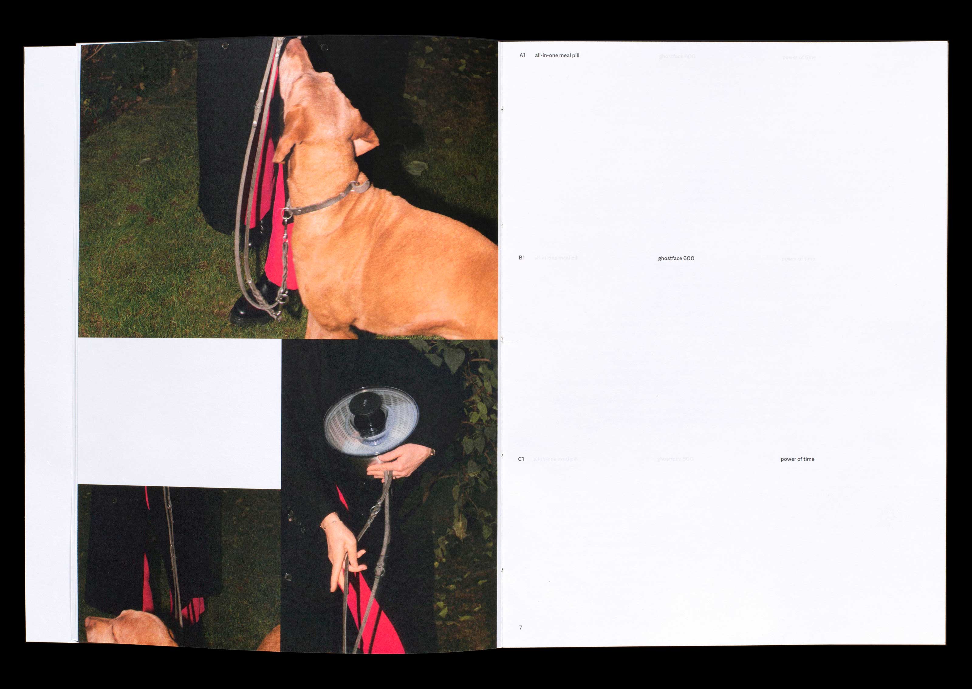
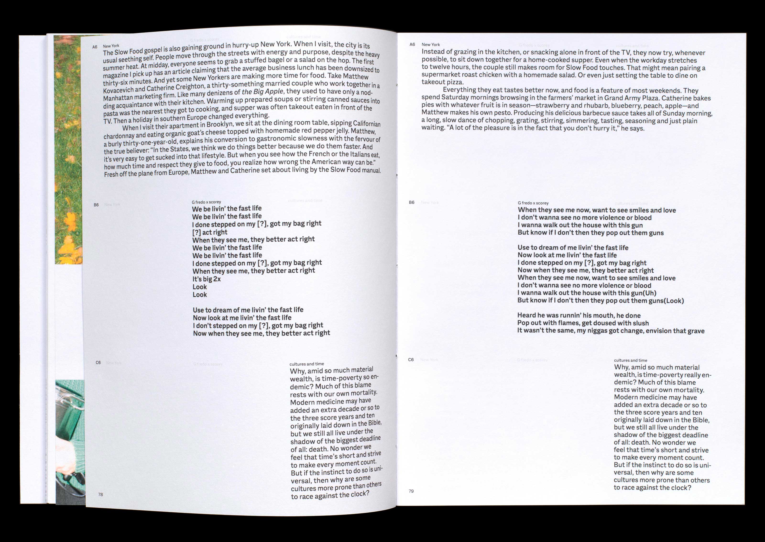
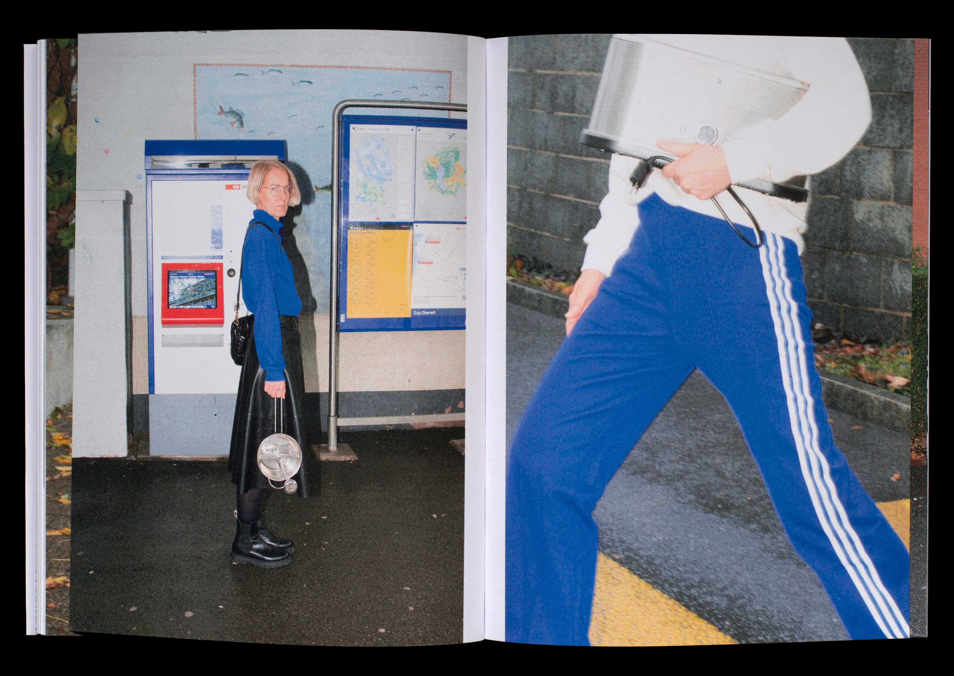
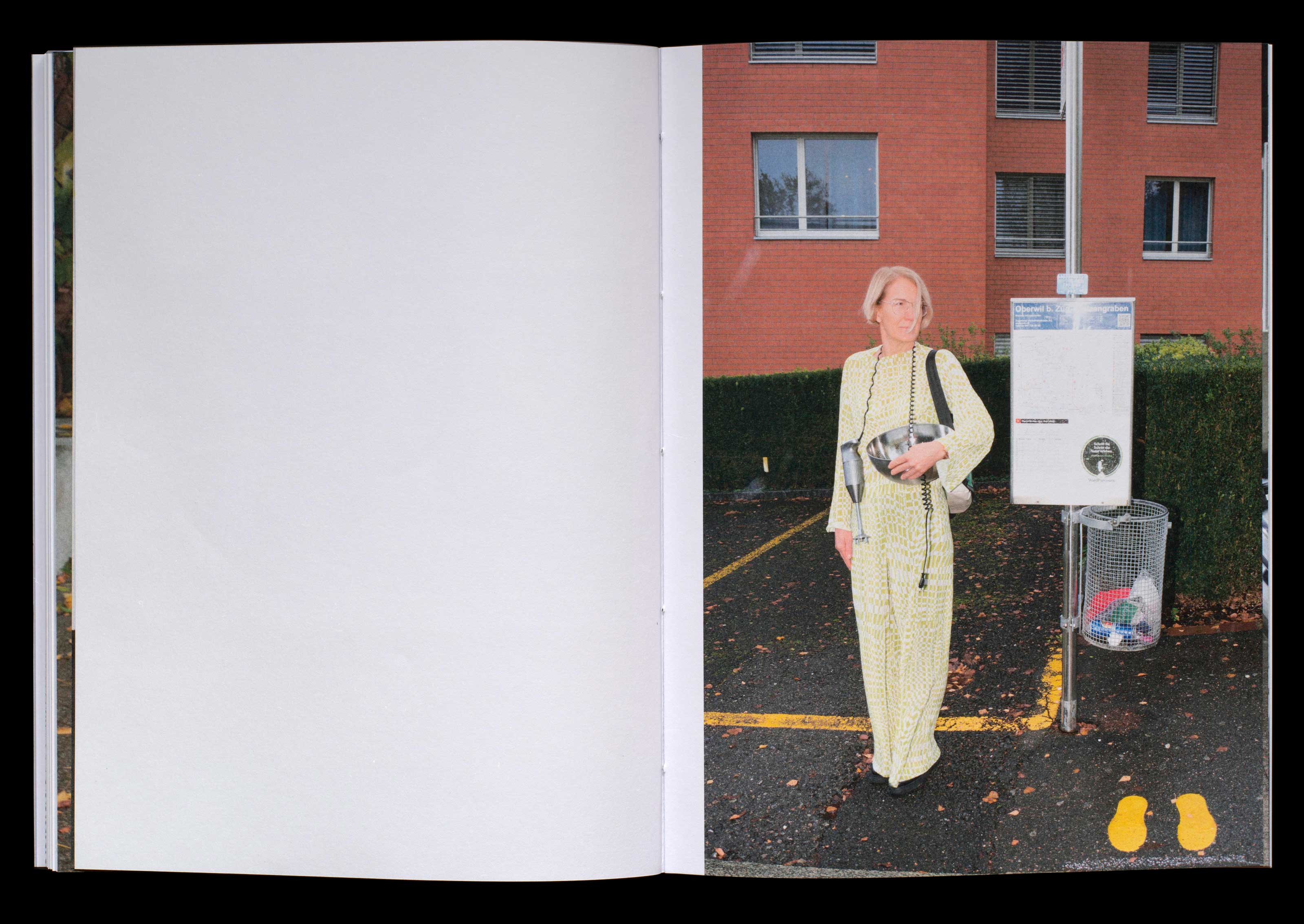
This book talks about how the human being ended up in such a fast world and how it affects the situation on our tables. The texts on the three topics, slow food (A), fast life (B) and the beauty of speed (C), were divided into chapters and run simultaneously on the pages. The challange was to present these three parts in a visually attractive and still readable way and combine them with my photo series.
fast life, slow food and the beauty of speed/ December 2022/ Book